Showing posts sorted by date for query beach painting. Sort by relevance Show all posts

Sunday, June 30, 2019

How to Create Depth in Landscape Paintings, Part III--Perspective in Skies

"Clouds Moving In", 14" x 11" acrylic painting
One of my worksheets for "Clouds Moving In"
     For Part III in this little series of posts about perspective, we will consider sky (especially clouds). Obviously, the painting of a large field with various trees both near and far, for example, will demand careful creation of depth in the ways we have discussed in Part I and Part II. But what about the sky in that painting? I do know that skies seldom appear just one monotone hue from the horizon on up and so often shade my painted sky from cobalt, ultramarine, or even slightly purplish blue at the top of the canvas to a slightly more aqua and lighter tone toward the horizon. This suggests distance in the sky.

     But I hadn't considered cloud perspective much until my painting mentor, Linda Blondheim, was providing feedback on a work in progress. She pointed out that clouds usually appear larger when they are closer and are smaller (and often flatter) in appearance toward the horizon. Linda encouraged me to make a grid with a vanishing point at the horizon to refer to as I painted a cloudy sky. Sounds obvious, I guess, but I was not observing the principle consistently in my work.


     I used that tip in the 14" x 11" acrylic piece, "Clouds Moving In", pictured above. I wanted to show clouds building over the Atlantic from the Northeast, as they often do here in coastal north Florida. So, the vanishing point is left of center (north) in the reference grid at the top of my worksheet (pictured above, left).


"Spring Breeze",  24" x 18" acrylic painting 
"Sea Oats", 16" x 12" acrylic painting
     Of course, real clouds are various sizes at various distances, but I have realized that my painted skies are most convincing looking when I follow some logical perspective rules for clouds. The 24" x 18" piece, "Spring Breeze" illustrates the principle as does the 16" x 12" painting, "Sea Oats".

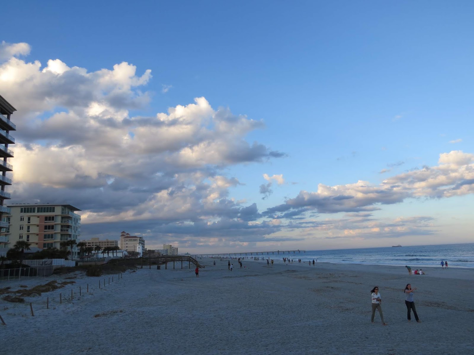
     Rather than more words today, I will simply share some of my photos that include clouds. Some are from my home area, some were taken for painting reference (not necessarily because they are stunning subjects in their own right), and some are from places we have traveled. Of course, you can click on any photo to enlarge it. You can draw your own conclusions about perspective in actual skies and how to create realistic depth in paintings that include clouds.
Jacksonville Beach, FL photo
Hanna Park, Jacksonville, FL photo


John C. Campbell Folk School, NC photo

Nova Scotia, Canada photo


Region of Tuscany, Italy photo
 Question of the Day: Have you ever thought about how clouds appear as they recede into the distance?

Sunday, December 23, 2018

"Spring Breeze"--Ocean Beach Painting is a Christmas Gift

     "Spring Breeze", an 18" x 24" acrylic painting on gallery-wrapped canvas, has now been adopted. My sister and her husband had a spot in their new Maryland  home that they hoped I could fill with an Atlantic Ocean beach painting. I was thrilled to send them images of 5 available pieces in various sizes and palettes (some in shops and one still in our home). They chose "Spring Breeze", a scene at Jacksonville Beach, Florida about 14 miles from our home. The difficulties involved in satisfactorily completing this piece have made it more precious to me, and I'm thrilled that they will enjoy it and that it will stay in the family.

     I am delighted when family members or special friends accept the gift of a painting (or a hand-painted silk scarf--see earlier post about that). Although I would not take a chance on presenting someone with a painting they may not have chosen for themselves or which may not fit in their home, it is a true joy to give a painting away when I know the recipients like and want it.

     I hope you and yours have a meaningful and merry holiday season and that the joy of giving remains central in your lives. All of you who are faithful readers of this blog are a gift to me. Thank you for providing me the opportunity to share photos and thoughts with you, and a special shout-out to those of you who kindly share your own thoughts in response.

Question of the day: What is a gift you have received that seemed particularly precious or meaningful?

Wednesday, October 31, 2018

Two Beach Paintings--Two Different Palettes

"Early Spring Dune"
     Artist's choice of color, color temperature, and palette are significant factors in the mood and overall impression of a painting on the viewer. These two acrylic beach paintings are both based on observation and reference photos from Jacksonville Beach on the Atlantic in Northeast Florida. Yet, they evoke different feelings, at least partly because of different color palettes. My style, an interpretive realism, does not attempt to copy what I see, but to represent my feeling and impression of the natural scene, so I sometimes modify colors.

     When I first began painting, I tested colors and color combinations but did not restrict the palette for a given work. I chose tube colors and various blends of those colors according to the scene and my inclination. Later, when I learned to limit the palette for each work, the results were much more unified, cohesive, and pleasing (at least to me).

     The first painting, "Early Spring Dune" with a view outside the white wall of an oceanfront home and yard, has stronger, clearer, warmer hues, as well as sharper edges than the second. The palette included: Cerulean blue, Paynes grey (which is bluish), Sap green, cadmium red deep, burnt sienna, Naples yellow, buff, white, and a touch of black in a few shadow mixes.


"Sea Oats"
     In the second piece, "Sea Oats", a softer light glows from a partly cloudy sky later in the day. Considerable artistic license inspired this palette because the reference photo was taken on such a grey day that it almost looks like a black and white print. Memories of mature sea oats at different times of outdoor study informed my color choices. The palette for this work included: cobalt blue, Paynes grey, permanent rose, yellow ochre, burnt umber, buff, white, and a bit of black. The hues were softened by blending some with their complements or with gentle neutrals. You may notice that the blue and yellow chosen are cooler than those for "Early Spring Dune". Using permanent rose was a mistake for this piece, by the way; although a lovely shade, it is strong and can be difficult to handle. Regarding the choice as a learning opportunity, I blended the rose into submission, practicing on heavy art paper until the result worked.

     Same off-shore island, different paintings. You may prefer one or the other, but I enjoy exploring a range of palettes and always keep a record of each painting's palette in the file with my reference photos, sketches, and a photo of the completed painting. Those files have sparked many new adaptations of previously used palettes.

Question of the day: What differences do you notice in your response to the two paintings?      

Sunday, February 18, 2018

Ocean Painting-- "Clouds Moving In"

"Clouds Moving In"

     Jacksonville, Florida's Atlantic Ocean beaches are long, wide, and ever-changing. The fascinating coastal skies also change often and look different every time we visit--we love living near this natural magnificence! 

     "Clouds Moving In", a 14" x 11" gallery-wrapped acrylic painting, portrays a late morning moment seen on a walk headed away from other beach goers. Happy to have a stretch of beach to myself, I took some reference photos and made notes about colors in the sky and water and the shifting shapes of the restless clouds.

     In previous ocean-front paintings (except for a sunrise scene painted for our son and his wife), I usually included dunes, sea oats, walkways, or other additional features of interest. This time, I wanted a view simply of beach, ocean, and sky with the focus on clouds building in the sky--a scene with its own kind of challenge in the simplicity. Preliminary sketches tested various composition possibilities. 


     Other projects (and life events) interrupted the painting process a few times. Periodic uncertainty about what to include and what to leave out also slowed the process, but I have finally decided (even with lingering uncertainty about a few aspects) to declare the piece "good enough" and "done". The seabirds rising were the final touch, adding a bit of life and movement to the scene.

     The palette for the work let the cool colors dominate with warmer tones in the sand and tinting some of the clouds. I used ultramarine and cerulean blue, Paynes grey, burnt sienna, and titanium white with touches of cadmium red light and cadmium yellow medium in some of the mixes.

Question of the day: Is it sometimes difficult for you to decide when a creative project is good enough to call "done"? 

P.S. Sorry the first link above ("previous ocean-front paintings") scoops up so many blog posts, some not as relevant as intended. I couldn't find a way to winnow them down, but feel free to take a look. A quick scroll through the batch will find any that might be of interest to you.


Tuesday, February 23, 2016

Painting of the Sun Rising Over the Ocean

     The painting of the sun rising over the Atlantic Ocean at Jacksonville Beach, Florida is finished, delivered, and now hangs in the master bedroom in the Jacksonville Beach home of our younger son and his wife. They are truly thrilled with it which is extremely gratifying to me after many hours working to make "Here Comes the Sun" all that they--and I--had hoped for. The piece is in acrylic paint on a 30" x 40" gallery-wrapped canvas. 


     For some background on the original request from them and the reference photos used, see an earlier post about creating a painting to coordinate with a room's decor. I was touched and honored by their faith in me. I was also more than a little scared to undertake the largest painting I had tried so far as well as facing the difficulty involved in painting a realistic sunrise (not overdone or cheesy). The result truly pleases me. If it hadn't worked out for their home, I would have placed the piece in one of the local shops that exhibits my work. That fallback plan reassured me during the process.

     The photos show the painting in their bedroom (taken in the evening) both with overhead lighting and then with softer lighting from side lamps as well as the painting alone against their golden-yellow wall.


     I apologize for the gap between my last post and this one and will try to write entries on a more regular basis again. I have completed three new hand painted silk scarves for you to see as soon as they are pressed and ready for a photo session. All my best to fellow creators, fellow bloggers, and faithful readers of this blog.

Question of the day: Have you taken on any particularly challenging projects creating art or craft pieces for people you love?


Tuesday, July 28, 2015

Creating a Painting to Match a Room's Decor

September sun fully risen over the Atlantic
     I have not yet planned a landscape painting specifically to match a room's decor. However, I do not necessarily try to duplicate the hues I see in a scene either. Since I sometimes determine a painting's color palette in advance for my own creative reasons, having an "assigned palette" may not be too different. So, when a beloved daughter-in-law asked for a painting to blend with the warm tones of the remodeled master bedroom in their Jacksonville Beach home, I was honored by her request and started planning. The room is painted a rich, warm yellow with bedding that quietly introduces orange and a soft sea-foam green, and Ashley wanted warm tones like orange and yellow to predominate in the painting.
About 15 minutes before sunrise

     So, blue sky and lush green vegetation are out--an Atlantic Coast sunrise is in. Why a sunrise rather than a sunset? Because here in Jacksonville, Florida, the sun rises over the ocean and sets over land. Although I have some nice ocean view photos taken around sunset, they lack rich, warm reflections in the water because the sun is setting behind the viewer over the land. 

Before sunrise looking north, showing morning mist
     Creating this painting does scare me because sunrise and sunset paintings seem quite difficult. They can either be gorgeous or can be so dramatic as to look phony, and I have avoided trying one so far. The other scary part is that this painting will be the largest I have undertaken to this point--in other words, a true learning experience lies ahead. I claim to love learning experiences, right?!?
Before sunrise, looking into heavier mist to the south

     These photos are of a sunrise we saw from a beach house weekend a little south of Jacksonville Beach. I plan to (carefully) intensify the warm colors somewhat, maybe with more clouds and more reflections in the water. A Google search for images of Jacksonville Beach, Florida sunrises has offered some possible modifications of the sunrise I personally saw and photographed. Of course, I would never paint directly from someone else's photos--just gather a few possible ideas to enhance my own original composition. As slowly as I paint (and given that I have a couple of other smaller projects in the works), you may not see the finished painting for a number of months. But I would love your suggestions for meeting the challenges of painting a sunrise. Please share!

     By the way, I know that many artists reject the very idea of creating or choosing a painting in colors to match decor. At home, I personally hang paintings or other wall art that we love, whatever the color scheme; landscapes in particular look fine anywhere in my view. However, I completely understand that many people like to complement or match a room's color scheme and will enjoy giving the challenge a try--especially for our fine son and his wonderful wife.

Question of the day: How do you feel about choosing art works to match the colors of the decor in a room?  


Saturday, December 13, 2014

Blog Hop, Part II--My Creative Process

A great blue heron, seen at  Jacksonville's Hanna Park
Somewhere in Michigan (a scene from memories)

     Thanks again to Mary Paquet for the invitation to contribute to the blog hop project by responding to four questions. I continue here with the two last questions (see my previous post for Part I). And don't miss Jo Castillo's post on Monday, Dec. 15; I "tagged" her to be next in the blog hop and know that you will enjoy her lively creative sense and fine art works.

3) Why do I create what I do?

     I have always enjoyed sewing, knitting, and crocheting, but did not believe I had any talent for the visual arts I so admired. My love for color and for the beauty of the natural world kept tugging me toward giving landscape work a try.
Castaway Preserve Cedar
Castaway Preserve Palms

     Finally, about 11 years ago, I signed up for a week-long class in acrylic painting at the John C. Campbell Folk School in North Carolina--expecting to enjoy playing with color and making creative messes, then to toss them and return home renewed and relaxed. Well, with an excellent teacher and time to practice and learn, I painted pieces that I really liked. No tossing occurred, and I was hooked! Now, with more workshops and lots more practice behind me, some pieces even sell. More importantly, I find continued delight in creating acrylic landscapes and learning more all the time. Another Folk School class this year started me in silk painting as well--a fluid, often unpredictable medium that gives me additional pleasure. Creating art is a whole new world for me and a rewarding pursuit in semi-retirement.
Jacksonville Beach
Jacksonville Beach

4) How does my creative process work?

     While considering this question, I used the little search box at the top of my blog and entered "painting process". Oh, my--I have written many posts that include discussion of the creative process in general and of the particular processes involved in individual paintings or silk scarves.
An early work--A favorite retreat near Warwick, NY

Silk scarf (using resist)
Silk scarf (natural blending--no resist)
     So, what are the common threads in varying processes for individual pieces? For processes in making the silk scarves, please see recent posts on that topic.
     
     Nearly all landscape paintings begin with a photo or a cluster of reference photos. Since I am endlessly fascinated with coastal North Florida scenes and want to convey the beauty and serenity I find in exploring out-of-the-way places in this area, I study angles of light, color (how to capture the incredible range of greens?!), and take notes to accompany the photos I take from various angles and distances.

     In the studio, the next considerations are composition (including tonal balance--the lights and darks) and color palette. In our area, good composition almost always involves leaving out some of the lush growth and sometimes other elements. Sketching--very roughly--a few possible versions of a scene, sometimes moving the point of view or focal point, helps me decide on a final version. Here are some previous posts that discuss composition.

     Choosing a limited number of colors helps both in unifying a painting and still gives an incredible range of possible hues. I don't try to match the actual scene so much as try to capture a feeling while staying in a realistic color range. Sometimes I go for low contrast and cool serenity, sometimes warmer, lively vistas. Again, here are some previous posts with more about color and palette for interested readers.

      Revision is the other most crucial piece of my process. The beauty of acrylics (especially for a learner like me) is that they dry quickly and cover well. I can paint over an area that does not please me, take out a superfluous bush, or whatever. Sometimes before a major change, I try it out by cutting a shape out of construction paper that approximates the change, tape it to the canvas, and squint to judge the effect on the composition.

     When wrestling with a piece that is not cooperating, it helps to remind myself that any work is a valuable learning experience (taking myself too seriously is fatal). At times, I put a painting away for a time and work on something else. A fresh look later on often yields a solution.

Question of the day: Do you enjoy hearing about the creative process or watching artists work? Or would you rather simply experience the art for yourself with no background or explanation given?

Monday, December 8, 2014

Around the World Blog Hop Entry--My Creative Process

   
Outside a back yard at Jacksonville Beach, FL
I was invited to join an Around the World Blog Hop (google that and be amazed!) by fellow artist Mary Paquet, whose work and blog I always enjoy and admire. Please visit Mary Paquet's blog to see for yourselves and for her Blog Hop entry on December 1. In turn, I have invited Jo Castillo, a delightful, talented artist and prolific blogger to post on Monday, December 15. All the past blog hop entries I have visited are fascinating as a variety of artists each answer four questions about their work and creative process.

     The invitation is welcome both because 1) I am a relatively new artist and 2) my blog is a mix of posts about both acrylic landscape painting and silk scarf painting AND lots of other aspects of creative living, including travel, cooking, exploring coastal North Florida, and more. I am honored that more established artists with more art-focused blogs to include mine. Thank you, Mary Paquet. My thoughts on the questions appear below (and, to spare you a truly endless post this time, will continue in a second post in a few days). Here and there a link will take interested readers to related posts on this blog. 

1) What am I working on? After a break from art due to travel, time with family and, well, the rest of life, I have several projects going now:
Matanzas River Bend
  • finishing touches on a gift for a friend--a 12" x 6" piece picturing a Matanzas River scene, just off the Atlantic Ocean. My friend has always loved the Matanzas Inlet area, near St. Augustine, Florida.
  • deciding what's next on a half-finished silk scarf with a purple iris motif; it needs more tonal contrast and/or some other revision (not pictured--stay tuned).
  • designing and making a scarf for a friend who wants it as a Christmas gift for someone special to her. She has a color scheme idea, and is trusting me for the rest. How scary is that?
  • A favorite scarf, painted in March
  • Finally, something new for me, planning a couple of paintings based on photos and memories of a recent time in Tuscany. Normally, I interpret scenes here in coastal North Florida because I know this area in depth. Can I capture the essence of a place only visited? Perhaps not, but I am hoping to convey my own impressions and appreciation of its beauty.
2) How does my work differ from others of its genre? Most bloggers, including me, regard this question as a stumper--hard to answer for oneself. Even some relative strangers have said that once they see a landscape I've painted, they recognize others as being my style, so the work does have distinctive elements. However, defining those elements is difficult. I'll mention a few common threads in most of the landscapes. Making scarves is simply too new for me to have developed a personal style; "experimenting" is the current mode in silk painting. (See posts on the week-long "art camp" silk painting class I enjoyed).  My landscape paintings usually include:
Another silk scarf favorite

  • A realistic style--although I "edit" actual scenes for good composition; they are far from photographic.
  • Many portray out-of-the way places that most people would pass without noticing. Prowling back roads, urban pocket parks, and nature preserves with my camera, I find quiet charm and beauty--painting ideas abound.
  • Water appears in a fair number of works. Here in Jacksonville, Florida, we enjoy the Atlantic Ocean (from a surprising variety of beaches), the mighty St. Johns River and a number of other rivers, quirky creeks (some of which would be called rivers in other regions--they are wide!), still ponds, and our bewitching, ever-changing salt marshes. I love both being near natural bodies of water and the challenge of painting water.
  • Marsh in Fort Caroline Preserve
  • Finally, the works reflect an effort to establish a clear focal point and visual path for the viewer.
Clear focal point, "Summer Reflections" 
3) Why do I create what I do?

4) How does my creating process work?

This post is long enough, so--hoping the blog hop police won't mind--I will post again in a few days with consideration of the last two questions.

   Don't forget to visit the delightful blog of fine artist Jo Castillo, who has agreed to be "tagged" as the next Monday blogger in this creative chain. Don't miss her post on December 15! 

Again, I am truly thankful to Mary Paquet for providing this opportunity. Given the many incredible blogs I have discovered following the chain from one creator to another, it took real self-discipline to stop browsing and post on time :).


Question of the Day: What are some delightful discoveries of people/ideas/visuals/blogs you have encountered recently as you browse the web?    

Wednesday, September 17, 2014

Small North Florida Waterscape Painting--Matanzas River Scene

     This small painting of a view across the Matanzas River from a public beach near St. Augustine, Florida, is not quite finished. However, I decided to show you the present (nearly completed) version today. Life has been full lately, and it's hard to say just when there will be time to make the remaining adjustments I have in mind.

     The acrylic on gallery-wrapped canvas piece is 12" wide and just 6" tall, in a kind of panoramic format. One of my reference photos appears in a post from more than two years ago when my husband and I enjoyed an outing to this area and nearby Crescent Beach. You can see photos from that day and read an account of it here. The Matanzas River is tidal, flowing into the Atlantic Ocean near this beach through the Matanzas Inlet (out of sight to your left as you view the scene).
     
     When ready, the painting will be a gift for a friend who once lived on a boat in this area. I wanted to get her perspective on how well I have captured the feel of the sand, water, vegetation, etc., so showed it to her recently. It was gratifying to get her stamp of approval on my interpretation of this lovely spot. She mentioned the distinctive, slightly pinkish sand and other aspects of the scene she knows so well and felt that this little painting captured the right tones and feel. That was a good feeling, especially since it is for her :>) .

     At first, this piece was intended as both a stand-alone work and a possible preliminary study for a larger painting, but for now, I'm happy with this version and do not expect to paint another. It's time to move on (whenever I manage to reserve painting time again) and to begin a different coastal North Florida landscape.

Question of the day: When you see--or create--a painting of a familiar scene, do you prefer to see it fairly realistically portrayed, or do you enjoy visual interpretations that "bend" what's there for an artistic purpose?

Thursday, July 25, 2013

Post # 200; The Creative Journey Continues

Late Day Clouds at Jacksonville Beach, FL, July 2013
     Here's an odd coincidence; in my very first post on April 21, 2009, I used the cloud photo that inspired my most recent painting. Now, I've reached the 200th post for this blog. Along with my recent 67th birthday, that's cause for some reflection--in the form of blog evaluation and overall gratitude. 

     Evaluation:
     1. Rereading that first post, I see that my intention was to post about twice a week, "perhaps sometimes more". That has slipped into a schedule more like twice a month, occasionally more often. Every so often, I feel badly about this rate and try to do more, but it hasn't lasted--at least not recently. However, my posting pace is right for me at this time. 
     2. Even more than the posting schedule, I try to improve on my once weekly or so session of visiting all the beautiful, varied, and interesting blogs written by the blogging friends I have been fortunate to "meet" along this journey. I'll continue to do my best, and I am humbled by those of you who manage frequent, quality posts as well as visits to other blogs (and comments) in the midst of many other commitments and pursuits.
     3. I do think that many of the posts in this blog have been thoughtfully developed. I know that writing them, editing and polishing them, and choosing appropriate photos has been meaningful for me; writing is a path to discovery, I think--of self and of other things that matter. It's fun to know they are of interest to you, as well.

     Gratitude:
     1. God's love, family, home, extended family, and priceless friends.
     2. Health, especially renewed comfort and mobility after a hip replacement. I don't expect perfect health or total freedom from aches and pains at my age, but overall--much to be thankful for.
     3. Meaningful work and play activities, including tutoring and painting--and so much more.
     4. Rewarding volunteer callings, including helping in the Peace Presbyterian Church Food Pantry (which does astonishing community service for a smallish congregation), pre-GED tutoring at the amazing Women's Center of Jacksonville (discovered through Volunteer Match), working to better our lovely, though very imperfect city through JAX2025, and other projects.
     5. The sometimes gentle, sometimes fearsome, beauty and mystery of nature.

      I could go on--and will in my daily meditation time--but will spare you all that and end with more gratitude.

THANK YOU, THANK YOU TO READERS WHO KEEP COMING BACK IN SPITE OF MY UNEVEN POSTING AND SOMETIMES RAMBLING WRITING. You make blogging fun and worthwhile. 

Saturday, January 19, 2013

Intracoastal Waterway Views Near Jacksonville, Florida

     Among our lovely wetlands and waterways here in Coastal North Florida, the Intracoastal Waterway provides a variety of views both for the boater and from the land. During an unusual warm spell last week, my friend Dee and I had a pleasant lunch to celebrate her birthday, sitting on the deck of the Ponte Vedra Beach Barbara Jean's Restaurant, situated on this waterway.


     Dee had suggested that we lunch there some nice day to enjoy the views from this waterside restaurant. A true friend, she keeps my landscape painting in mind wherever she goes and has guided me to discoveries and scenes I might not have found otherwise. 

     These photos show the bank across from us (you are looking west at the mainland from the long, narrow off-shore island on which the Jacksonville area Atlantic Ocean beaches lie). The vegetation is so thick here that it is difficult to pick out an ideal painting composition from what naturally presents itself, but every element is good background for inclusion in possible paintings. The bare cypress in the vertical photo (say hello to the osprey perched at the top) could anchor an excellent painting and provide a strong vertical and a perfect contrast to a green expanse. 

     As we ate and chatted, the tide began to run out (headed north--to our right from here) and revealed a growing beach-like area on the opposite bank that also added variety to our view. And various dead trees, stumps, and angling tree trunks serve as sculptural elements that could enrich a painting composition.


     I am grateful to Dee for showing me this area, which is markedly different from some nearby stretches of the intracoastal waterway bordered by flat, wide salt marshes (like the views in the old movie "Prince of Tides"). In other areas, thicker wooded areas include stately, centuries-old live oak trees dripping with Spanish Moss. And of course, the stretch of the intracoastal that runs straight through the heart of the city of Jacksonville, following the St. Johns River, provides boaters a completely different kind of view of tall buildings, our symphony hall and live theatre venue, along with riverside restaurants, shops, and entertainment sites.

     Just as I did the last time Dee took me on a find-some-paintings tour of some of her favorite spots, I'll let you know when any of these elements--or perhaps, a full scene--appear in a painting. 


Question of the day: Aren't observant friends, appreciative of the natural world around us, a treasure to cherish?

Friday, November 30, 2012

Second Show of Paintings at Paddiwhack Gallery

     I am thrilled to have a second opportunity to show paintings in the featured "nook" at the front of the wonderful Paddiwhack Shop in Gainesville, Florida. It is an honor and privilege to have works hung together in this premier location in the store. It has been about a year and a half since I last exhibited there. This group of pieces (plus one called "Sanderling in the Surf", which is featured elsewhere in the shop) shared the coveted pre-holiday time period with Paddiwhack's unique selection of holiday-themed items. Of course, all the other delightful treasures Paddiwhack is known for are also available in their wonderful, large space. As always, you can click on a photo to enlarge it.


     All the pieces in this exhibit are new to Paddiwhack. Given my slow painting pace and the various life events that occurred and kept me from painting at times in recent months, it was a challenge to produce and mount the 12 works shown at the shop. Since I have at some time posted about the Coastal North Florida explorations that led to the subjects for these works and about the painting process for each piece, I won't discuss that today. 

     One goal for this exhibit was to present a greater variety of sizes and prices than I had in the previous exhibit. The little pair of 5" x 7" marsh paintings seen on the chest near my artist's statement and business cards are the smallest, while the largest are two 18" x 24" paintings above that chest on the left. One shows a winter day at Big Talbot Island Park here in North Florida, where waves are gradually undermining a bluff causing trees, one by one over time, to fall into the water. The other represents a view of the St. Johns River by the National Historic Site at Kingsley Plantation. Whoops, there is one other in that size which the shop had kept from my previous exhibit--a view of the Atlantic Ocean at Jacksonville Beach, looking over the dunes and a foot bridge--seen on a side wall. 

     Thank you all for your good wishes as I recover from total hip replacement surgery. I am amazed and deeply grateful for the miracle of a new joint, for freedom from long-standing, constant pain, and for the wonder of growing strength and mobility the surgery and excellent physical therapy are making possible. I feel like a new woman!


Question of the day: Are you considering small, locally owned businesses like Paddiwhack and goods made in the USA in your holiday gift shopping?

Thursday, October 18, 2012

Studying Cabbage Palms for Better Painting

In my newest painting, which I'll show you soon, three cabbage palms frame one side of the scene. They are seen fairly close up, so needed to be painted quite accurately. Painting a realistic cabbage palm tree proved more complicated than expected. After all, I thought, there were some decently rendered distant palms in some of my paintings, and I had good results with a tropical beach scene that had the island sort of palms near the viewer. Painting them close up was a whole new challenge, humbling, but very interesting.

Cabbage palms (technically the Sabal palmetto, Florida's state tree) are actually quite complex. The fronds in the canopy grow out on various levels as the tree grows taller. In nature, the lower fronds gradually brown, droop, and eventually drop off, sometimes cleanly and sometimes leaving spiky pieces of stem behind (as on the loosely trimmed palms in the photo above). At the national historic site scene I was working on, the browned lower fronds had been regularly trimmed away from the palms, leaving a mostly bright green "lollipop" shaped top. For visual interest, I had decided to add a few browned fronds hanging down, but did incorporate the fairly smooth trunk with no spikes sticking out, just as I saw it at the historic Kingsley Plantation. The plantation is one of our favorite places to visit or to bring out-of-town guests; if you wish, you can view previous Kingsley Plantation posts here.

As I worked to learn more about the cabbage palm, my mentor, Linda Blondheim, advised me and provided one of her own printed tutorials with detailed pointers on painting various species of palm trees. The tutorials may be available from Linda--here is a way to contact her. I also viewed dozens of palms on a perfectly timed weekend watching the dogs at our kids' beach town home while they were away. The yard of their home has gorgeous stands of palm trees, Then, just the shortest walk in their area provided many more palms to study and photograph--each with its own unique form and character. That weekend, I sketched a few palms and parts of palms to get a good feel for them and took dozens of photos, some showing a whole tree or stand of trees, others mid-range, and some intense close-ups for information about details. Back in the studio, the painting flowed much more successfully--will post the results soon.


By the way, please bear with me for a couple of months with less frequent posts. Mark is recovering well from recent rotator cuff repair surgery, and I go in next week for total right hip replacement. I plan to prepare a few posts the rest of this week (if all goes well) that can post automatically, but probably two posts a month will be my max for awhile.
Question of the day: Do you also find that one of the joys (and sometimes, frustrations) of creative pursuits is that each new project presents new challenges and opportunities to grow?