Showing posts sorted by relevance for query beach painting. Sort by date Show all posts

Monday, March 22, 2010

Learning--North Florida Beach Painting, Final Version

Here is a better photo of the 16" X 12" dune and beach scene from a reference photo taken on a calm day at Jacksonville Beach in coastal North Florida. A few posts ago, I described the painting process and the revisions in this piece from a combination of my own ideas and the expert advice I received from my mentor Linda Blondheim's e-critique service. An added hint of low waves breaking just over the sight line of the dip in the dunes is one small change not in this photo. Since I forgot to take another picture before I added the final coat of satin finish medium to the painting, I am posting this photo. It is much more difficult to get an accurate photo after the medium is on, given slight reflective areas under any normal lighting conditions. Dune Shadows is now signed, sealed and ready for sale.
I loved getting your comments on the previous post. My favorite comments reflected a preference for a previous version with more of an opening in the dune grasses. Even though that is a gentle criticism of the final version, I didn't mind at all. The fact that some of you were disappointed that there was no longer an obvious way down to the beach struck me as a very positive reflection on the painting. What I hear in those comments is that viewers are actually putting themselves "into the picture", and I am delighted by that. Besides, no one is supposed to cross over the dunes as they are protected, both for the sake of the natural vegetation and critters living there and to help prevent erosion (not that a mental crossing when viewing a painting hurts anything).
I have a nice set of photos of a wooden walkway nearby, one of many crossings up and down the miles of gorgeous beach on our city's off-shore island. When I figure out what angle I'd like and how best to compose the scene, I'll start on a painting just for all y'all who want to run into a painting and onto that beach. Thank you for giving me the idea for a new work.
Question of the day: Isn't feedback wonderful? I love hearing reactions to my work, even thoughtful negative ones (in moderation :>) as I continue my lifelong learning journey.

Tuesday, July 28, 2015

Creating a Painting to Match a Room's Decor

September sun fully risen over the Atlantic
     I have not yet planned a landscape painting specifically to match a room's decor. However, I do not necessarily try to duplicate the hues I see in a scene either. Since I sometimes determine a painting's color palette in advance for my own creative reasons, having an "assigned palette" may not be too different. So, when a beloved daughter-in-law asked for a painting to blend with the warm tones of the remodeled master bedroom in their Jacksonville Beach home, I was honored by her request and started planning. The room is painted a rich, warm yellow with bedding that quietly introduces orange and a soft sea-foam green, and Ashley wanted warm tones like orange and yellow to predominate in the painting.
About 15 minutes before sunrise

     So, blue sky and lush green vegetation are out--an Atlantic Coast sunrise is in. Why a sunrise rather than a sunset? Because here in Jacksonville, Florida, the sun rises over the ocean and sets over land. Although I have some nice ocean view photos taken around sunset, they lack rich, warm reflections in the water because the sun is setting behind the viewer over the land. 

Before sunrise looking north, showing morning mist
     Creating this painting does scare me because sunrise and sunset paintings seem quite difficult. They can either be gorgeous or can be so dramatic as to look phony, and I have avoided trying one so far. The other scary part is that this painting will be the largest I have undertaken to this point--in other words, a true learning experience lies ahead. I claim to love learning experiences, right?!?
Before sunrise, looking into heavier mist to the south

     These photos are of a sunrise we saw from a beach house weekend a little south of Jacksonville Beach. I plan to (carefully) intensify the warm colors somewhat, maybe with more clouds and more reflections in the water. A Google search for images of Jacksonville Beach, Florida sunrises has offered some possible modifications of the sunrise I personally saw and photographed. Of course, I would never paint directly from someone else's photos--just gather a few possible ideas to enhance my own original composition. As slowly as I paint (and given that I have a couple of other smaller projects in the works), you may not see the finished painting for a number of months. But I would love your suggestions for meeting the challenges of painting a sunrise. Please share!

     By the way, I know that many artists reject the very idea of creating or choosing a painting in colors to match decor. At home, I personally hang paintings or other wall art that we love, whatever the color scheme; landscapes in particular look fine anywhere in my view. However, I completely understand that many people like to complement or match a room's color scheme and will enjoy giving the challenge a try--especially for our fine son and his wonderful wife.

Question of the day: How do you feel about choosing art works to match the colors of the decor in a room?  


Sunday, December 23, 2018

"Spring Breeze"--Ocean Beach Painting is a Christmas Gift

     "Spring Breeze", an 18" x 24" acrylic painting on gallery-wrapped canvas, has now been adopted. My sister and her husband had a spot in their new Maryland  home that they hoped I could fill with an Atlantic Ocean beach painting. I was thrilled to send them images of 5 available pieces in various sizes and palettes (some in shops and one still in our home). They chose "Spring Breeze", a scene at Jacksonville Beach, Florida about 14 miles from our home. The difficulties involved in satisfactorily completing this piece have made it more precious to me, and I'm thrilled that they will enjoy it and that it will stay in the family.
     I am delighted when family members or special friends accept the gift of a painting (or a hand-painted silk scarf--see earlier post about that). Although I would not take a chance on presenting someone with a painting they may not have chosen for themselves or which may not fit in their home, it is a true joy to give a painting away when I know the recipients like and want it.

     I hope you and yours have a meaningful and merry holiday season and that the joy of giving remains central in your lives. All of you who are faithful readers of this blog are a gift to me. Thank you for providing me the opportunity to share photos and thoughts with you, and a special shout-out to those of you who kindly share your own thoughts in response.

Question of the day: What is a gift you have received that seemed particularly precious or meaningful?

Saturday, July 18, 2009

Exploring & Growing--Landscape Painting, Jacksonville Beach scene

I have showed you some of my landscape paintings in previous posts and have described the creative process for each. If you wish to see them, you can view posts from June 12 & 17 and May 1 & 7 or simply enter "landscape painting" in the search box above. The June entries showed how my individual composition decisions used and yet modified the scene in the original reference photo. 
I have a painting of a grey heron at a lake in Hanna Park, here in Jacksonville, Florida almost finished and am excited that I will be showing it to you soon. That painting also grew away from the original reference photo as I worked and struggled with the vision I had for it. Although I am very happy with each of those finished pieces, I can recall vividly how I despaired along the way, wondering why the painting refused to gel--why it seemed determined to remain clumsy and unsatisfactory.
Today's painting is a different case. Although you will see differences--a painter almost never simply copies nature, this photo and painting are more closely related than usually happens. Exploring Jacksonville Beach with our little beach-loving Shih-Tzu one mild late winter day, I saw early flowers blooming by a white concrete fence. I took several photos and decided that the one above would make a lovely medium-sized painting. It required minor adjustments only to make a painting I am very fond of. Some paintings require extensive sketching, planning, adjusting, and revising to grow into a vision I like. Then again, sometimes, all I need to do is to observe nature and go with the flow.
Question of the day: When creativity comes easily, do you ever wish it happened that way every time? Would that really be for the best?

Wednesday, July 21, 2010

Growing--Painting Process--Using a Limited Palette

When I first started painting, I used whatever paint colors I thought would best mimic the actual landscape that was my subject or sometimes used my "artistic license" to attempt to improve on nature, choosing whatever colors I wanted. Although this approach can work, and some of those pieces turned out well, I have been more pleased with the results of using a so-called "limited palette" approach. That means using just certain selected paint colors throughout one painting. Two happy results of this change were that the pieces seemed to have better internal unity and were more pleasing to the eye (in my opinion) and secondly, that I discovered a tremendous power and range in color blends. Even a limited palette can produce amazing variety in color and tone. Rich neutrals result from combinations of opposites on the color wheel, like producing an earthy, warm brown from mixing red and green (which can be varied with different reds or greens from the tube) or like the range of lively greys emerging from purple/yellow or blue/orange combos. Alternatively, one can use the opposite (complementary) color in small amounts to soften a tube color. For example, a too-strong blue for painting a realistic sky color can be knocked back with the right orange, or even with a few drops of burnt sienna.
The painting in today's photo shows early spring wildflowers at Jacksonville Beach against a white fence, photographed near an oceanfront home. A dear friend purchased the painting at my Open Studio Reception this past November, so I visit it often. The other photo shows some of the palette experimentation and notes that led to the palette used for the piece. Other color combos I tried and rejected for this particular painting are saved in a file for possible future use. The colors used here are cerulean blue, paynes grey (which is also bluish), sap green, cadmium red deep, burnt sienna, Naples yellow, buff, black, and white, with a touch of orange added later for bright highlights in the flowers. This May, I started a second painting from the same set of beach photos, one which includes a nearby bridge over the protected dunes down to the beach, and am using this identical palette again. If some of you are interested in this topic, I will include palette details in an occasional future post showing paintings. Please let me know what you think.
Question of the day: I think I have asked this before, but can't resist again--where would be without color in our world?

Monday, June 13, 2011

Creativity, Spontaneity, and Planning--Starting a Beach Painting

My regular readers (bless you, one and all!) know that I am a planner. Too a fault! Even in my creative endeavors, I plan. Previous posts have described my usual painting process (if you are interested, enter "painting process" as a search term in the box in the upper left corner of this blog). However, I know planning and taking care with things can be overdone--especially in projects like making a painting. You will chuckle to hear that this week, I am "working on spontaneity".
Since the flurry of finishing paintings for the exhibit at Paddiwhack, I have been working on a vertical piece showing a curving path. It has been moving ahead very slowly, and recently seemed as though the adjustments I made to try to improve it were making things worse. Some paintings are just very stubborn, even though they looked like a great idea in planning and sketching. The best response is sometimes to put it away for awhile and to begin a new piece.
This time, I decided to plunge into the new piece with minimal planning, no sketches, and no tonal studies. It seemed that I had become too careful, too picky over details--and, stuck. What appealed was to start a smallish piece in unusual proportions (12" x 6") with a fairly low horizon focusing on an interesting sky. With a few reference photos and four paint colors (so far), I forced myself to quickly lay in the first coat for the piece in about 20 minutes. It was fun!
Here are a couple of the reference photos--including one of our Shih-Tzu, Magnolia (aka Maggie) tearing down Jacksonville Beach--one of her favorite spots. The block-in of the painting is rough, but seems like a good start. The sky is a mix of cerulean blue and white near the horizon and ultramarine blue and white further up; the ocean uses the same colors, plus a bit of Paynes grey near the horizon. All blues are tempered with a bit of Cadmium red light to neutralize them (tube colors sometimes look phony in landscapes). The beach under-layer is mostly Cad red light and white. This will be adjusted, as our sand is actually somewhat grey-beige, but I want a warm tone present in both the sand and the clouds (which are yet to come).
Question of the day: Am I the only nut who sometimes needs to "work at spontaneity"? How do you overcome creative blocks?

Wednesday, September 17, 2014

Small North Florida Waterscape Painting--Matanzas River Scene

     This small painting of a view across the Matanzas River from a public beach near St. Augustine, Florida, is not quite finished. However, I decided to show you the present (nearly completed) version today. Life has been full lately, and it's hard to say just when there will be time to make the remaining adjustments I have in mind.

     The acrylic on gallery-wrapped canvas piece is 12" wide and just 6" tall, in a kind of panoramic format. One of my reference photos appears in a post from more than two years ago when my husband and I enjoyed an outing to this area and nearby Crescent Beach. You can see photos from that day and read an account of it here. The Matanzas River is tidal, flowing into the Atlantic Ocean near this beach through the Matanzas Inlet (out of sight to your left as you view the scene).
     
     When ready, the painting will be a gift for a friend who once lived on a boat in this area. I wanted to get her perspective on how well I have captured the feel of the sand, water, vegetation, etc., so showed it to her recently. It was gratifying to get her stamp of approval on my interpretation of this lovely spot. She mentioned the distinctive, slightly pinkish sand and other aspects of the scene she knows so well and felt that this little painting captured the right tones and feel. That was a good feeling, especially since it is for her :>) .

     At first, this piece was intended as both a stand-alone work and a possible preliminary study for a larger painting, but for now, I'm happy with this version and do not expect to paint another. It's time to move on (whenever I manage to reserve painting time again) and to begin a different coastal North Florida landscape.

Question of the day: When you see--or create--a painting of a familiar scene, do you prefer to see it fairly realistically portrayed, or do you enjoy visual interpretations that "bend" what's there for an artistic purpose?

Wednesday, February 29, 2012

Work in Progress--Dune, Ocean, and Sea Oats Painting

This North Florida dune painting has been difficult for me to assess and complete. The reference photos were taken in dim conditions, so I am trying to recreate the brighter glow of some late afternoons at the beach just from my memory and from more recent walks on our Atlantic Ocean beaches. However, none of the days I have gone recently have had the atmospheric and light conditions I remember from a certain summer day. Late day photos I have taken in other locations along the shore have been some help, but haven't solved all the problems.
As many of us who make any sort of thing (art work, cake, cabinet, poem, garden, scrapbook, tin whistle, song, quilt, . . . ) know, some creations are more satisfying than others. I always struggle with each painting, but some really please me when they are finished. Others, less so. I have learned from experience that a piece I do not like as well as others may still appeal to someone else. In a previous post, I described how a painting delighted a client of the Trends Home Decor shop (although I did not mention that I had never liked that piece much and once considered painting something else over it!). She ignored all the other pieces I had in the shop and bought my least favorite. Viva la difference, n'est pas?
So, here's the thing. I have this particular work in progress (a 12" x 16" acrylic painting on gallery wrapped canvas) hanging on the wall and feel strongly that it needs further revision. I also know that it will probably never be a favorite among my creations, so have to resist overworking it and ruining any good qualities it might have. Interestingly, when I photographed it, looking at the photo gave me a bit of distance, and the piece didn't seem quite so bad.
The more distant beach line still needs work. It has been very hard to get the right perspective, to show how the dune slopes down onto the beach in the near right corner compared to the glimpse of the shoreline farther away, past the edge of the dune. I also may have made the sky too blue and bright for a late afternoon, although it sometimes looks this way, and I really don't want to grey it down much. Finally, this stretch of dune had a much thicker stand of sea oats, which would be an unattractive visual mess if exactly duplicated on canvas. I'd like to add a few more stalks, smaller and less prominent than those featured here, but don't want to overdo it.
Any suggestions you might have would be very welcome. Please don't just flatter the piece (you readers are all so sweet and kind); it does need some revision. What do you think?
Question of the day: How critical are you of your own creations and production? To what extent does your self-criticism work in your favor, and when does it hinder you?

Tuesday, February 23, 2016

Painting of the Sun Rising Over the Ocean

     The painting of the sun rising over the Atlantic Ocean at Jacksonville Beach, Florida is finished, delivered, and now hangs in the master bedroom in the Jacksonville Beach home of our younger son and his wife. They are truly thrilled with it which is extremely gratifying to me after many hours working to make "Here Comes the Sun" all that they--and I--had hoped for. The piece is in acrylic paint on a 30" x 40" gallery-wrapped canvas. 


     For some background on the original request from them and the reference photos used, see an earlier post about creating a painting to coordinate with a room's decor. I was touched and honored by their faith in me. I was also more than a little scared to undertake the largest painting I had tried so far as well as facing the difficulty involved in painting a realistic sunrise (not overdone or cheesy). The result truly pleases me. If it hadn't worked out for their home, I would have placed the piece in one of the local shops that exhibits my work. That fallback plan reassured me during the process.

     The photos show the painting in their bedroom (taken in the evening) both with overhead lighting and then with softer lighting from side lamps as well as the painting alone against their golden-yellow wall.


     I apologize for the gap between my last post and this one and will try to write entries on a more regular basis again. I have completed three new hand painted silk scarves for you to see as soon as they are pressed and ready for a photo session. All my best to fellow creators, fellow bloggers, and faithful readers of this blog.

Question of the day: Have you taken on any particularly challenging projects creating art or craft pieces for people you love?


Saturday, December 12, 2009

Exploring--Our North Florida Winter Beach Plus Bidding Update

I wish you all a very joy-filled holiday season. Although we try to keep our Christmas season low key and focused on what really matters, it is still a fairly busy time. Because of that, our little Shih-Tzu, Maggie, and I have not been to the beach in the last few weeks. Missing the wide sweep of sand with timeless waves rolling in, I decided to post a few Jacksonville Beach photos with today's greetings.
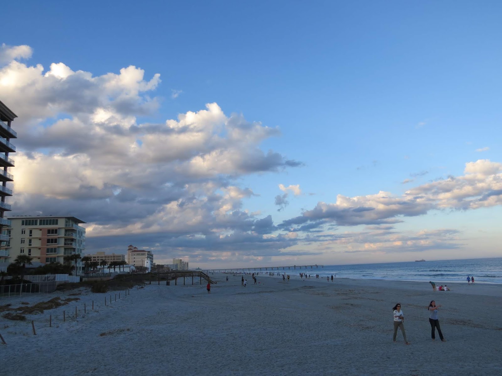
These are early winter shots, taken on two different November days, quite late in the day. The sun setting behind homes and buildings casts long shadows on the sand. The beach in one photo is littered with broken shells, kelp and other marine vegetation, tossed up by wind-driven waves at high tide on a stormy day. Looking up the beach, you may be able to see the Jacksonville Beach Pier in the distance.
Now, a month later, fewer people would be wading in the cooling water, and the only swimmers would be visitors from Canada or Minnesota or someplace like that. They've come al the way to Florida for the warm weather, and by golly, they're going to jump in that ocean even though both the air and North Florida's Atlantic waters are chilly.
OK, I've talked myself into it. Instead of missing the beach, I promise myself to walk there sometime this week, even for a short visit. It will be good for my peace of mind and spiritual center.
Question of the day: If this is a busy time for you, what quiet, centering moments do you plan to include in the next few weeks?
Bidding for the 9" x 12" original painting, Purple Iris Solitaire, remains at zero, so it looks like a low bid will take it. Deadline for bidding is noon on Monday, December 14. Bidding starts at $12; a bid of $20 or more will win you free shipping in the US and $5 off international shipping. Scroll down for more details and a photo of the painting.

Thursday, February 25, 2010

Learning and Growing--Critique Service Results on Dune Painting

On February 1, when I posted this 12" x 16" painting as a work in progress (the small photo), it was ready for comments from my painting mentor, Linda Blondheim. You can scroll down to that post for more information about Linda's teaching services and a link to her website. I had signed up for her e-critique service for the month of February and have found it immensely valuable in the development of five paintings. I was aware of several changes this piece needed, and Linda suggested other modifications--most of which I included in the revision. By the way, I photographed the earlier version in much brighter light, so please don't think that the whole painting is darker now. If you'd like to see more detail, you can click on the photos to enlarge them.
The work seems about finished to me, but you will notice that it is not yet signed. That means it will rest for awhile so that I can live with it and decide if any further tweaking is desirable. As I have mentioned before, knowing when to stop revising is both crucial and difficult in any art form. The piece is based on reference photos from a June visit to Jacksonville Beach, Florida, looking out at the Atlantic Ocean over the dunes. All along Jacksonville's offshore islands, the dunes are protected so that natural vegetation and critters can thrive; beach visitors may cross to the beach only on boardwalks.
For those of you who are interested, here are the main details of the revision. Probably the most noticeable change is the stronger, darker fence. Since it is the focal point, it needed more drama in size and tonal value. Even those of you who paint may not guess what gave me the most trouble in this piece--it's the top half of the dune on the right. In the earlier version, the tall grasses drew attention to themselves and distracted both from the fence and from the bright wildflowers that I considered a secondary focal area. As Linda and I considered various possible fixes, I first painted the grass out completely but did not like the look of the dune completely bare either. My final solution was to cover more of that dune with grasses, carefully keeping them soft, nearly uniform, and neutral in tone so that they would blend with the dune and not pull attention away from more important areas. Other changes in tonal balance (degrees of dark and light) on the horizon line, on the sunlit left dune top, and in the foreground increased the interest and drama of the scene. The ocean is deliberately kept as a quiet area, somewhere for the viewer's eye to rest, as one looks out toward an interesting, but not overly dramatic, sky. The painting now captures my impression of that lovely June day.
Question of the day: In your creative projects, do you enjoy the ups and downs of the process, or do you feel impatient for completion?

Monday, August 30, 2010

Learning--New Painting of North Florida Beach, "Spring Breezes"

Adapted (fairly freely) from a photo I took at Jacksonville Beach, this painting shows a dune crossing at a relatively quiet spot along our amazing off-shore island. Wildflowers were loving the early spring warmth (hint, the photo was not taken this past, unusually chilly, winter) on a March day. "Spring Breezes" developed slowly, even though I had made sketches and careful plans. Something about the look of it seemed lifeless to me along the way in spite of the bright blossoms. Fortunately, I was scheduled for another month of e-critique with my painting mentor, Linda Blondheim, and she helped me realize my original vision--plus.
Today, I won't go through the whole story of the evolution of this piece. Perhaps I will post more details about the painting process soon, but for now, have decided to let it speak for itself. After all, if visual art needs words, we are not fully doing our job :>). Of course, some visual art is meant to be paired with words or other media, and that can be wonderful. That was not the plan in this case, and I hope it stands alone. You can click on the photo to enlarge it and see more detail, but I also have some detail photos to accompany a future post about the painting process. Just one note about the scene: If you are familiar with Jacksonville Beach, you know that our dunes are not really this high. Hence my earlier disclaimer about freely adapting the actual scene--using my "artistic license" again, friends. Just one more thought before I close for today:
Question of the day: For me, the paintings that I have struggled with most sometimes grow on me, even becoming favorites. Does that happen for you--whether in visual arts or any other challenging undertaking?

Saturday, December 26, 2009

Learning--Winter Beach Painting--Patterns in the Sand

Not too long ago, I posted an entry about winter walks on the beach. This painting, Tide Pool Patterns, evolved from photos on a winter walk several years ago. That day, the Atlantic was in a rare indigo mood (the water color is never exactly the same from day to day, changing sometimes subtly, sometimes quite dramatically), and the waves were crashing very white. The receding tide had left shallow pools and interesting patterns and ridges in the sand. I think the earlier hours had been fairly windy, because the beach was more stirred up than sometimes. The view was interesting to me almost in an abstract sense, and I hoped to create a very simple, somewhat empty (if that's the right word) scene where the tonal contrasts, some strong, some subtle, and the abstract design would be the focus.
As in many paintings, this one did not look right for quite awhile. When I painted the wavy patterns in the sand as they actually appeared, it did not work on the canvas because they slanted so sharply that they gave the impression of going steeply downhill. Not wanting to lose the texture and diagonal interest and yet needing a more realistic look, I fought the angles and patterns for several painting sessions until the sand appeared flatter. In the foreground, I sprinkled salt on the wet paint to create some sparkly dimension on a few of the ridges of sand. Even clicking on the detail photo probably doesn't show you that texture, but it's kind of nice. I feel fairly pleased with the final result, which I hope conveys a feeling of peace contrasted with the energy of the background waves.
Question of the day: Isn't it interesting what makes for visual interest and how central a part different kinds of contrasts play in what is pleasing to the eye?

Wednesday, October 31, 2018

Two Beach Paintings--Two Different Palettes

"Early Spring Dune"
     Artist's choice of color, color temperature, and palette are significant factors in the mood and overall impression of a painting on the viewer. These two acrylic beach paintings are both based on observation and reference photos from Jacksonville Beach on the Atlantic in Northeast Florida. Yet, they evoke different feelings, at least partly because of different color palettes. My style, an interpretive realism, does not attempt to copy what I see, but to represent my feeling and impression of the natural scene, so I sometimes modify colors.

     When I first began painting, I tested colors and color combinations but did not restrict the palette for a given work. I chose tube colors and various blends of those colors according to the scene and my inclination. Later, when I learned to limit the palette for each work, the results were much more unified, cohesive, and pleasing (at least to me).

     The first painting, "Early Spring Dune" with a view outside the white wall of an oceanfront home and yard, has stronger, clearer, warmer hues, as well as sharper edges than the second. The palette included: Cerulean blue, Paynes grey (which is bluish), Sap green, cadmium red deep, burnt sienna, Naples yellow, buff, white, and a touch of black in a few shadow mixes.


"Sea Oats"
     In the second piece, "Sea Oats", a softer light glows from a partly cloudy sky later in the day. Considerable artistic license inspired this palette because the reference photo was taken on such a grey day that it almost looks like a black and white print. Memories of mature sea oats at different times of outdoor study informed my color choices. The palette for this work included: cobalt blue, Paynes grey, permanent rose, yellow ochre, burnt umber, buff, white, and a bit of black. The hues were softened by blending some with their complements or with gentle neutrals. You may notice that the blue and yellow chosen are cooler than those for "Early Spring Dune". Using permanent rose was a mistake for this piece, by the way; although a lovely shade, it is strong and can be difficult to handle. Regarding the choice as a learning opportunity, I blended the rose into submission, practicing on heavy art paper until the result worked.

     Same off-shore island, different paintings. You may prefer one or the other, but I enjoy exploring a range of palettes and always keep a record of each painting's palette in the file with my reference photos, sketches, and a photo of the completed painting. Those files have sparked many new adaptations of previously used palettes.

Question of the day: What differences do you notice in your response to the two paintings?      

Thursday, October 18, 2012

Studying Cabbage Palms for Better Painting

In my newest painting, which I'll show you soon, three cabbage palms frame one side of the scene. They are seen fairly close up, so needed to be painted quite accurately. Painting a realistic cabbage palm tree proved more complicated than expected. After all, I thought, there were some decently rendered distant palms in some of my paintings, and I had good results with a tropical beach scene that had the island sort of palms near the viewer. Painting them close up was a whole new challenge, humbling, but very interesting.

Cabbage palms (technically the Sabal palmetto, Florida's state tree) are actually quite complex. The fronds in the canopy grow out on various levels as the tree grows taller. In nature, the lower fronds gradually brown, droop, and eventually drop off, sometimes cleanly and sometimes leaving spiky pieces of stem behind (as on the loosely trimmed palms in the photo above). At the national historic site scene I was working on, the browned lower fronds had been regularly trimmed away from the palms, leaving a mostly bright green "lollipop" shaped top. For visual interest, I had decided to add a few browned fronds hanging down, but did incorporate the fairly smooth trunk with no spikes sticking out, just as I saw it at the historic Kingsley Plantation. The plantation is one of our favorite places to visit or to bring out-of-town guests; if you wish, you can view previous Kingsley Plantation posts here.

As I worked to learn more about the cabbage palm, my mentor, Linda Blondheim, advised me and provided one of her own printed tutorials with detailed pointers on painting various species of palm trees. The tutorials may be available from Linda--here is a way to contact her. I also viewed dozens of palms on a perfectly timed weekend watching the dogs at our kids' beach town home while they were away. The yard of their home has gorgeous stands of palm trees, Then, just the shortest walk in their area provided many more palms to study and photograph--each with its own unique form and character. That weekend, I sketched a few palms and parts of palms to get a good feel for them and took dozens of photos, some showing a whole tree or stand of trees, others mid-range, and some intense close-ups for information about details. Back in the studio, the painting flowed much more successfully--will post the results soon.


By the way, please bear with me for a couple of months with less frequent posts. Mark is recovering well from recent rotator cuff repair surgery, and I go in next week for total right hip replacement. I plan to prepare a few posts the rest of this week (if all goes well) that can post automatically, but probably two posts a month will be my max for awhile.
Question of the day: Do you also find that one of the joys (and sometimes, frustrations) of creative pursuits is that each new project presents new challenges and opportunities to grow?

Sunday, June 30, 2019

How to Create Depth in Landscape Paintings, Part III--Perspective in Skies

"Clouds Moving In", 14" x 11" acrylic painting
One of my worksheets for "Clouds Moving In"
     For Part III in this little series of posts about perspective, we will consider sky (especially clouds). Obviously, the painting of a large field with various trees both near and far, for example, will demand careful creation of depth in the ways we have discussed in Part I and Part II. But what about the sky in that painting? I do know that skies seldom appear just one monotone hue from the horizon on up and so often shade my painted sky from cobalt, ultramarine, or even slightly purplish blue at the top of the canvas to a slightly more aqua and lighter tone toward the horizon. This suggests distance in the sky.

     But I hadn't considered cloud perspective much until my painting mentor, Linda Blondheim, was providing feedback on a work in progress. She pointed out that clouds usually appear larger when they are closer and are smaller (and often flatter) in appearance toward the horizon. Linda encouraged me to make a grid with a vanishing point at the horizon to refer to as I painted a cloudy sky. Sounds obvious, I guess, but I was not observing the principle consistently in my work.


     I used that tip in the 14" x 11" acrylic piece, "Clouds Moving In", pictured above. I wanted to show clouds building over the Atlantic from the Northeast, as they often do here in coastal north Florida. So, the vanishing point is left of center (north) in the reference grid at the top of my worksheet (pictured above, left).


"Spring Breeze",  24" x 18" acrylic painting 
"Sea Oats", 16" x 12" acrylic painting
     Of course, real clouds are various sizes at various distances, but I have realized that my painted skies are most convincing looking when I follow some logical perspective rules for clouds. The 24" x 18" piece, "Spring Breeze" illustrates the principle as does the 16" x 12" painting, "Sea Oats".

     Rather than more words today, I will simply share some of my photos that include clouds. Some are from my home area, some were taken for painting reference (not necessarily because they are stunning subjects in their own right), and some are from places we have traveled. Of course, you can click on any photo to enlarge it. You can draw your own conclusions about perspective in actual skies and how to create realistic depth in paintings that include clouds.
Jacksonville Beach, FL photo
Hanna Park, Jacksonville, FL photo


John C. Campbell Folk School, NC photo

Nova Scotia, Canada photo


Region of Tuscany, Italy photo
 Question of the Day: Have you ever thought about how clouds appear as they recede into the distance?

Wednesday, July 13, 2011

Jacksonville Beach Painting Progress--Focus on Sky and Sea

It has finally been possible to get back to the Jacksonville Beach scene I began painting a few weeks ago, a small piece in a panoramic format, 6" X 12". Sky and sea were my main interest in this little study, which I worked to keep quick and minimal. Although the piece is not finished, I wanted to show you its present form. The birds are just quick-sketched in with white and grey tones and need some adjustment. There will be a few other refinements in the clouds, beach sand, and waves, but the basics are all here.
As I mentioned a couple of posts ago, working more quickly was a goal for this piece. I work slowly and include a great deal of detail in my larger paintings--perhaps too much at times. The point of this exercise was to help me fight a tendency to be too fussy and instead to take a breezy, minimal approach, intentionally working in shorter sessions.
The palette is very simple: ultramarine blue, cerulean blue, paynes grey, cad red light, a touch of burnt umber (a warm brown), and titanium white. The top photo shows the entire piece; the other is a detail shot. This has been a satisfying study, and I am looking forward to more exercises in a breezier style in the future as well as to planning some larger paintings in my more typical style.
Question of the day: Are you trying something at least a little new and different this summer?

Wednesday, January 18, 2012

Beach Scenes Are Enhanced by Shadows

Now that we have returned from a refreshing week away, I return to the shadow theme with a few examples of beach scenes.
Reflecting about the importance of shadows in painting (and in any visual experience or art form), I realized how crucial shadows have been in some of my recent beach scenes. Views of the ocean or other large bodies of water and expanses of shoreline can be fairly bare and lacking in obvious shadows. Although such scenes can serve as excellent subjects for serene, minimalist art works, including an object or objects, either natural or built on a beach or dune, creates opportunities for drama in contrast of the lights hitting the objects and the darks of shadow areas.
Particularly at the ocean here in Northeast coastal Florida, the sunlight can be very intense, casting strong, deep shadows. Here are three examples. Each of them has appeared in a previous post or two; clicking on the links will provide more information about them.
In the smallest, 6" x 12" painting, "Away from the Crowd", a bright red beach chair contrasts with the softer natural hues and draws the eye. But try to imagine the exact same scene on an overcast, misty day--or with the sun directly overhead so that the shadow would not extend out. The scene would still be nice, but some movement and interest would be lost. Further, notice the subtle dimensionality in the clouds due to the warmer, brighter light on the sunny side.
In the 12" x 16" vertical, "Dune Shadows", I was most interested in the patterns of the fence and its shadows on the rolling surface of the dune. Again, it seems that the scene would be more static and less interesting without the clear shadow design.
Finally, the 18" x 24" "Spring Breeze" demonstrates the extent to which a bright day at the ocean creates contrasting darks and lights. If the sun were straight overhead, the sand would be more monotonal; the foot bridge would be plainer, and the clouds would again be flatter-looking. Even the sky would have less color variation and less apparent depth.
Question of the day: Do you find yourself drawn to scenes with strong light and shadow contrasts or to quieter views with subtler contrast?

Tuesday, September 14, 2010

Learning and Growing--Painting Process on Dune and Beach Piece, "Spring Breeze"

Today's post is designed for readers interested in my landscape painting process and in composition design in particular. The photos above show earlier stages of "Spring Breeze", with the final version at the top. The lower left photo is quite early, with some elements, like the sky and footbridge, more developed and others, like the wildflowers, just barely indicated. It was a real challenge to get the balance and focal point to work well on this piece. My painting mentor Linda Blondheim provided invaluable advice during a couple of months of using her e-critique services. With her guidance, I gradually added more curve to the path--even the second version of the path in the photo on the right changed further later on. The evolution of the path illustrates how landscape artists sometimes need to adjust features in the actual scene for a more pleasing composition. The first version reproduces the way the path actually looked in my reference photo, but adding curves and more variation provided a much more graceful lead into the scene. In a departure from my usual process, I painted the footbridge in a fairly detailed form early on because I was strongly drawn to the sharp shadows cast by the railing. Since that area was my intended focal point, I worked to render the bridge in correct perspective from the beginning.
I have no idea how often I painted out and revised the wildflowers on the left side. Although they are a major element, I wanted them to balance, but not compete with, the footbridge and its interesting shadow pattern. An important step in solving the overly even seesaw look of the foreground was to make the left side dune higher. At one point, I cut some scrap paper into a much higher dune shape, taped it (with masking tape) to the canvas, and emailed that image to Linda. She agreed that a higher dune made the composition more interesting than having so many elements on roughly the same level, but suggested going a bit lower than the line of my cut-out. However, I hesitated before revising the dune so radically because Jacksonville Beach dunes are not that steep. We landscape painters vary, I think, in the degree to which we are willing to change the actual scene when we work from nature or reference photos. For several days, this work-in-progress stood on the fireplace mantel for consideration while I worked on other paintings. The need for a greater variation in line won out over realism. Also, since steeper dunes grace some nearby beaches, the change was not completely out of line.
If some of you are interested, I will talk about the process of painting the sky and clouds in "Spring Breeze"in a future post. It can be difficult to achieve a semi-transparent, wispy effect with acrylic paints, so sharing our methods could be fun.
Question of the day: More of a reflection than a question this time: For me, achieving an interesting balance of compositional elements in a painting, with both dynamic tension and restful features, seems like a metaphor for a set of life skills we all need. What do you think?
