skip to main |
skip to sidebar
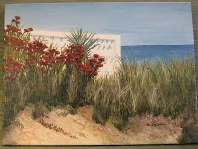 |
| "Early Spring Dune" |
Artist's choice of color, color temperature, and palette are significant factors in the mood and overall impression of a painting on the viewer. These two acrylic beach paintings are both based on observation and reference photos from Jacksonville Beach on the Atlantic in Northeast Florida. Yet, they evoke different feelings, at least partly because of different color palettes. My style, an interpretive realism, does not attempt to copy what I see, but to represent my feeling and impression of the natural scene, so I sometimes modify colors.
When I first began painting, I tested colors and color combinations but did not restrict the palette for a given work. I chose tube colors and various blends of those colors according to the scene and my inclination. Later, when I learned to limit the palette for each work, the results were much more unified, cohesive, and pleasing (at least to me).
The first painting, "Early Spring Dune" with a view outside the white wall of an oceanfront home and yard, has stronger, clearer, warmer hues, as well as sharper edges than the second. The palette included: Cerulean blue, Paynes grey (which is bluish), Sap green, cadmium red deep, burnt sienna, Naples yellow, buff, white, and a touch of black in a few shadow mixes.
 |
| "Sea Oats" |
In the second piece, "Sea Oats", a softer light glows from a partly cloudy sky later in the day. Considerable artistic license inspired this palette because the reference photo was taken on such a grey day that it almost looks like a black and white print. Memories of mature sea oats at different times of outdoor study informed my color choices. The palette for this work included: cobalt blue, Paynes grey, permanent rose, yellow ochre, burnt umber, buff, white, and a bit of black. The hues were softened by blending some with their complements or with gentle neutrals. You may notice that the blue and yellow chosen are cooler than those for "Early Spring Dune". Using permanent rose was a mistake for this piece, by the way; although a lovely shade, it is strong and can be difficult to handle. Regarding the choice as a learning opportunity, I blended the rose into submission, practicing on heavy art paper until the result worked.
Same off-shore island, different paintings. You may prefer one or the other, but I enjoy exploring a range of palettes and always keep a record of each painting's palette in the file with my reference photos, sketches, and a photo of the completed painting. Those files have sparked many new adaptations of previously used palettes.
Question of the day: What differences do you notice in your response to the two paintings?


