Showing posts with label planning a landscape painting. Show all posts

Tuesday, July 28, 2015

Creating a Painting to Match a Room's Decor

September sun fully risen over the Atlantic
     I have not yet planned a landscape painting specifically to match a room's decor. However, I do not necessarily try to duplicate the hues I see in a scene either. Since I sometimes determine a painting's color palette in advance for my own creative reasons, having an "assigned palette" may not be too different. So, when a beloved daughter-in-law asked for a painting to blend with the warm tones of the remodeled master bedroom in their Jacksonville Beach home, I was honored by her request and started planning. The room is painted a rich, warm yellow with bedding that quietly introduces orange and a soft sea-foam green, and Ashley wanted warm tones like orange and yellow to predominate in the painting.
About 15 minutes before sunrise

     So, blue sky and lush green vegetation are out--an Atlantic Coast sunrise is in. Why a sunrise rather than a sunset? Because here in Jacksonville, Florida, the sun rises over the ocean and sets over land. Although I have some nice ocean view photos taken around sunset, they lack rich, warm reflections in the water because the sun is setting behind the viewer over the land. 

Before sunrise looking north, showing morning mist
     Creating this painting does scare me because sunrise and sunset paintings seem quite difficult. They can either be gorgeous or can be so dramatic as to look phony, and I have avoided trying one so far. The other scary part is that this painting will be the largest I have undertaken to this point--in other words, a true learning experience lies ahead. I claim to love learning experiences, right?!?
Before sunrise, looking into heavier mist to the south

     These photos are of a sunrise we saw from a beach house weekend a little south of Jacksonville Beach. I plan to (carefully) intensify the warm colors somewhat, maybe with more clouds and more reflections in the water. A Google search for images of Jacksonville Beach, Florida sunrises has offered some possible modifications of the sunrise I personally saw and photographed. Of course, I would never paint directly from someone else's photos--just gather a few possible ideas to enhance my own original composition. As slowly as I paint (and given that I have a couple of other smaller projects in the works), you may not see the finished painting for a number of months. But I would love your suggestions for meeting the challenges of painting a sunrise. Please share!

     By the way, I know that many artists reject the very idea of creating or choosing a painting in colors to match decor. At home, I personally hang paintings or other wall art that we love, whatever the color scheme; landscapes in particular look fine anywhere in my view. However, I completely understand that many people like to complement or match a room's color scheme and will enjoy giving the challenge a try--especially for our fine son and his wonderful wife.

Question of the day: How do you feel about choosing art works to match the colors of the decor in a room?  


Thursday, September 8, 2011

Painting Process--My Easel Set-up

Today, you see a typical set-up at my easel. For most paintings, I place an old piece of heavy poster board against the easel behind the canvas so that I can tape things to it for reference. Nearly all my landscape pieces are studio paintings based on actual scenes, so the main reference photos go up on the board first. Below, you see one of the marsh reference photos I am using for these small paintings. The other item you see in this easel photo is a sheet of paper with a couple of quick sketches and other notes. Many of you know that I am a planner, rather than painting completely spontaneously. However, the amount of advance planning varies for different paintings. This is a relatively simple example for a pair of 5" x 7" salt marsh paintings, currently in progress.
In the photo of the sheet of paper, you see that I have done minimal sketching for these pieces. Given their rocky progress to this point, I may have done better to prepare more detailed value studies, planning the balance of lights and darks--but I didn't this time. I also did less in the way of color studies than I might do for larger works, but I did explore some of the possible gold and buff mixes for the dry winter grasses. Notice (learned this the hard way) that I recorded the tube colors used for each mix and also wrote down the colors used for sky and water (though without a sample patch) and the list of tube colors for this particular limited palette. Some artists probably can do with less written down, but I often am working on several pieces at the same time, so one may be set aside for awhile. It definitely helps to have notes about color blends used when I return to a work in progress after some time has passed.
Linda Blondheim, my painting mentor, suggested this blog post topic when I journeyed over to Gainesville, Florida on Saturday for one of her Open Studio Classes. I am thrilled that she is offering this class again; she had stopped for a number of months, and I missed the guidance she offers painters with any work they bring to the gathering. When Linda saw this set-up, she felt that others might like a peek at my typical messy work board. You can find earlier posts on similar topics by entering "painting process" in the blog search box, top left of this blog. The June 28, 2010 post in particular shows the planning materials and easel set-up for a study of a shore bird--somewhat like this board. And, as always, you can click on a photo to enlarge it and see more detail.
Question of the day: What triggers, tools, or processes aid you in creative endeavors (whether "artistic " projects or creative problem solving and everyday living)?

Monday, June 13, 2011

Creativity, Spontaneity, and Planning--Starting a Beach Painting

My regular readers (bless you, one and all!) know that I am a planner. Too a fault! Even in my creative endeavors, I plan. Previous posts have described my usual painting process (if you are interested, enter "painting process" as a search term in the box in the upper left corner of this blog). However, I know planning and taking care with things can be overdone--especially in projects like making a painting. You will chuckle to hear that this week, I am "working on spontaneity".
Since the flurry of finishing paintings for the exhibit at Paddiwhack, I have been working on a vertical piece showing a curving path. It has been moving ahead very slowly, and recently seemed as though the adjustments I made to try to improve it were making things worse. Some paintings are just very stubborn, even though they looked like a great idea in planning and sketching. The best response is sometimes to put it away for awhile and to begin a new piece.
This time, I decided to plunge into the new piece with minimal planning, no sketches, and no tonal studies. It seemed that I had become too careful, too picky over details--and, stuck. What appealed was to start a smallish piece in unusual proportions (12" x 6") with a fairly low horizon focusing on an interesting sky. With a few reference photos and four paint colors (so far), I forced myself to quickly lay in the first coat for the piece in about 20 minutes. It was fun!
Here are a couple of the reference photos--including one of our Shih-Tzu, Magnolia (aka Maggie) tearing down Jacksonville Beach--one of her favorite spots. The block-in of the painting is rough, but seems like a good start. The sky is a mix of cerulean blue and white near the horizon and ultramarine blue and white further up; the ocean uses the same colors, plus a bit of Paynes grey near the horizon. All blues are tempered with a bit of Cadmium red light to neutralize them (tube colors sometimes look phony in landscapes). The beach under-layer is mostly Cad red light and white. This will be adjusted, as our sand is actually somewhat grey-beige, but I want a warm tone present in both the sand and the clouds (which are yet to come).
Question of the day: Am I the only nut who sometimes needs to "work at spontaneity"? How do you overcome creative blocks?

Thursday, January 13, 2011

Growing--Planning a Painting Composition--Jacksonville Park Scene

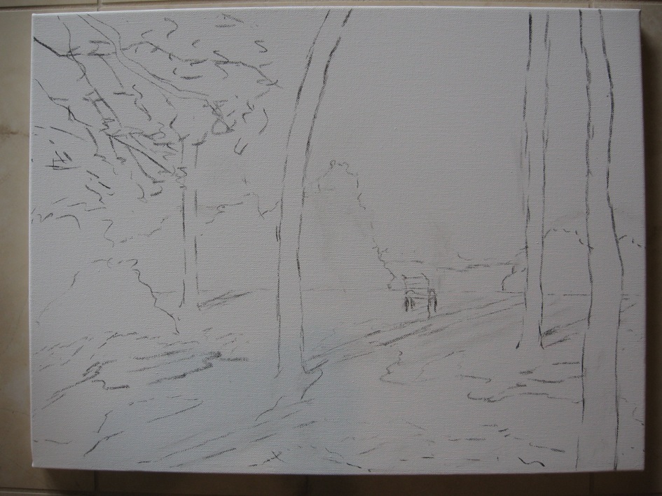
A new 18" x 24" landscape painting on gallery wrapped canvas is nearing completion. I am pleased with the way this scene is turning out and will show you the final version soon. In the meantime, here are the original reference photo, an early line sketch on the canvas, and the first painting stage--blocking in the darkest areas.
As we explore our wonderful coastal North Florida scenery, I take a variety of reference photos for landscape painting. Some photos, like this one, comprise an overall view of a place I might paint in the future. Others record odd bits of information: everything from close-ups of particular tree trunks, to interesting cloud formations, to ripple patterns on our rivers or ponds. One wise word of advice for landscape painting I have heard from more than one instructor is, "Don't make it up." Of course, we do use artistic license to move elements around or to add, say, an appropriate water bird to one of its favorite habitats. However, for me at least, it is crucial to see and photograph the actual water bird or examples of a particular variety of tree in order to paint them convincingly.
While studying reference photos, I make rough sketches of possible compositions based on that location. I try the horizon fairly high, then lower; place only a few tree trunks in the scene, then sketch it with more trunks in a different pattern. In the sketches (often with 5 different grey to black values of markers on cheap paper), I also vary the values, placing the darks, mid-tones, and lights differently each time. A composition with equally distributed values is usually much less interesting than a composition with mostly one value, some of another, and just a bit of the third main value.
For the scene in this photo, I decided to leave out some of the bushes behind the grassy area to reveal the river running behind them. A bench or chair would appear near the riverbank to invite the viewer to enter the scene and rest awhile. Choosing what seemed the most promising small sketch, I outlined the major shapes on the canvas with vine charcoal, which rubs off easily later and which acrylic paint covers well. In some compositions, I begin by "sketching" with a brush and paints in the family of colors I plan to use (more about the palette chosen for this piece in the next post), but for this one, the balance and rhythm of the lines seemed important to place first.
In the top photo, you see a beginning placement of some of the values, especially some of the darkest areas. The foreground shadows first attracted me to the scene and will provide a visual path to the focal point (the bench and its surroundings). The other darkest elements will be some of the tree trunks and the hanging branches at the top of the canvas. Unlike some paintings, this one was pleasing even in the early stages; the composition and value "map" felt right.
Question of the day: As in other creative pursuits, including problem-solving in work and daily life, we are all very different regarding the degree to which we plan ahead. Clearly, I am a planner--how about you?