Showing posts sorted by relevance for query silk scarf. Sort by date Show all posts

Tuesday, May 29, 2018

Coral and Rose Hand-painted Silk Scarf Using a Shibori Technique


The completed silk scarf
     This hand-painted silk scarf was an experiment using a technique derived from traditional Japanese shibori silk dyeing methods. For the 60" x 11" silk scarf, I chose three dye colors, an orange-toned coral, a mix of coral and yellow, and rose. 

     To make this design, I accordion-folded and ironed the blank white scarf lengthwise in 6ths and then folded it back and forth in triangles somewhat like the ceremonial folding of a flag, ironing the folds as I worked. I used wooden clothespins to clip the three corners and hold the folds in place. The exact directions (with diagrams) are in Fabric Surface Design by Cheryl Rezendes (from our wonderful public library). In a previous post, I showed you a scarf made by twisting before dyeing, the idea taken from the same book.
When scarf is first unfolded
Center section-vertical folds only

     Only the ends of the scarf were folded, which was not my plan, but happened because folding the entire scarf would have made too thick a bundle to handle. I knew that leaving a section in the middle simply accordion-folded would also create a nice effect and would give the scarf some variety. 

     Also an accident (this was my very first effort at a folding technique, after all) was the different color saturation of the two ends of the scarf. After making and clipping the flag folds, I set one edge of the folded triangle in a flat dish with about 1/4" of dye in it (as the book directed). It all promptly fell over, soaking that part in coral dye. I quickly pulled it out and used a brush to soak each of two sides of that triangle with each of my other colors (on top of the unwanted extra coral). On the other end, I just saturated the three edges, each with one of the three colors (no dish of dye=no danger of the bundle taking an unintended swim).
The end that "took a bath" in coral dye
The second end completed--brushed on color only

    Finally, I brushed a generous amount of dye on the edge of each long strip in the center section and let the whole thing dry for a couple of days. 

     I enjoyed this experiment and will be better prepared to make a future scarf using the flag fold technique--perhaps one with only 4 lengthwise folds and with different colors.

Question of the day: What recent creative experiment have you enjoyed?

Sunday, September 16, 2018

Brown, Rust, and Beige Hand-painted Silk Scarf Using Shibori Technique

     Using two new dye colors from a recent order as well as a deep brown already in my stock, I experimented with another Shibori technique somewhat similar to the flag fold technique I used for a coral toned scarf. I was delighted with the results--once again a complete surprise for me as a newbie to this style of silk dyeing. In fact, I couldn't wait to show this scarf to you. The dyes still need to be steam set, which will make the colors even richer. Then the scarf will be ready for its first thorough washing and careful pressing. Here, it still sports its Shibori folds.


center section detail
     The scarf's rich tones resulted from two factors. One is the inherent beauty of these French silk dye colors. The other was my concern that the dyes were not penetrating deeply enough into the folds, leading me to soak certain areas with additional dye. For this scarf, I was trying to color it all, not to leave any spots white.

     These techniques are wonderful and sort of magical. The dye flow follows the folds and settles more heavily on the edges of the folds as the silk dries. I do not think that even an experienced Shibori artist could control or predict the exact design results. With less color saturation, this particular folding pattern produces a simpler chevron design. Obviously, my heavier use of dye resulted in a more complex final pattern.


detail from one end
detail from the other end
     A few more details for those of you who are interested in my process: I folded this 11" x 60" silk scarf lengthwise just four times rather than the six times used on the coral scarf. Then, the diagonal folds were made in a back and forth triangular pattern rather than the flag fold used on the ends of the coral scarf. Each fold was pressed as I worked. The result was a long folded strip rather than the triangular packet of the flag fold technique. I folded the strip in half lengthwise, soaked it with water, and placed it in a large aluminum foil pan to dye. Soaking a brush (about 3/4" wide) in one color after another, I saturated various areas, some larger than others. The scarf air-dried for more than 24 hours. When I unfolded it, magic!

     There is a link to an earlier post about the flag folded coral scarf above. One other Shibori inspired scarf using a twisting method stars in another previous post. Both posts credit the author and book that guided my experimentation; this brown, rust, and beige scarf also followed directions from that wonderful book, adapted my own way.

Question of the day: My landscape painting and silk scarf dyeing and painting give me a variety of creative experiences, some mostly under my control and some free form and surprising like Shibori dyed scarves. Do you prefer one kind of creativity over the other--loose or controlled? I thrive on both.


Saturday, March 31, 2018

Coral and Olive Twist--a Hand-painted Silk Scarf

Coral and Olive Twist Hand-painted Silk Scarf
     I made this silk scarf in coral, sage, and olive hues by a different method than my usual technique of painting on a scarf stretched on a frame. For this scarf (and one other I'll show you soon), I used twisting or folding techniques that do not require a stretcher frame.

Another view, before the scarf was steam-set and pressed
     The technique came from a library book. The "Fold and Color" chapter in Fabric Surface Design by Cheryl Rezendes (published in 2013) presents step-by-step guidance for a number of  designs--some have roots in Japanese shibori hand-dyeing and others are reminiscent of tie-dyeing. 

     For this scarf, I twisted a 60" x 11" plain white silk scarf tightly (the author suggested fastening one end to something; instead, I asked my husband to hold one end while I twisted the other). Eventually, the twisted scarf began to fold in on itself; at that point, I folded the twist in half lengthwise and secured the ends together with a rubber band.


Detail view
     Placing the twisted bundle on a plastic tray, I then used an eye dropper and sometimes a brush full of paint to drop coral and olive dyes alternately (but not in a perfectly even pattern) on the folds of the twist. I soaked the areas well with dye, but with uneven saturation. Sometimes I let the colors run together, which I knew from earlier testing made a nice brownish hue. Of course, I turned the twist over and made sure all sides had adequate dye.

     After letting the scarf dry thoroughly (it took a couple of days until I had time to go back to the project; it was probably dry after 24 hours or so), I opened it out to discover the pattern you see here. Since I used French silk dyes, the scarf required steam setting, so I waited until I had 3 other pieces to make a batch. Then, I steamed, washed, and pressed it.

     For those interested, I obtain all my silks, French silk dyes, and other tools and supplies at Dharma Trading and have had excellent service from them. These two colors, Olive Green and Coral Red, are Tinfix brand, made in France by Sennelier. Some of my dyes are made by Dupont, a former French company I believe is now in Belgium.

Question of the day: Do you haunt the library and sometimes find fun how-to books there, or do you use information or videos from the internet--or both?

Thursday, September 29, 2016

Ocean-Inspired Aqua, Blue, and Purple Hand-painted Silk Scarf

An 11" x 60" one-of-a-kind, hand-painted silk scarf
     This ocean-inspired aqua, blue, and purple hand-painted silk scarf, 11" x 60", was a delight to paint. I used French-
style silk dyes and began with diluted blue and aqua to paint the large middle area in pale shades, blending well. Just as a clear sky shades slightly from a truer blue appearance overhead to a more aqua look nearer the horizon, I used blue in the very center and shaded to aqua further from center. 


     Of course, I was not trying to make a realistic ocean and sky picture, but hoped to suggest them. In the second stage, I used stronger (much less diluted) hues and began to work on the very ends. The mottled areas result from liberal doses of kosher salt--salt draws wet dye up to create random jagged patterns. What is the area meant to represent? you may ask. I had some thoughts, but mostly wanted some variety in the look of the ends of the scarf. People who have seen it each have their own ideas: currents deep down, the ocean bottom, coral, the movement of sea creatures. Take your pick; it's fun to imagine what shape and texture could represent.

Seen from another angle 

     Working up from the ends, I laid in wavy strips of various shades of blue, aqua, and purple, along with some deep rose. I had some of these shades premixed and ready; others resulted from the colors overlapping and mixing on their own or from adding subsequent tones over the first layer of color. 

     When I approached the "sky" area, I used gutta as a resist (more information here) to draw wiggly outlines for a suggestion of currents and waves (click on any photo to enlarge). Once the gutta had dried, I could continue to create undulating watery tones--using gradually lighted versions of the colors. Since French silk dyes are transparent up to seven layers of color, I could add and modify any of the hues until the result felt right.
The earlier silk scarf, made in my class

     When I originally learned the art of silk painting from Donna Kassab at the John C. Campbell Folk School (see posts about the class here), one of my first silk scarf creations (and still a favorite) was a 22" square ocean-inspired piece. That design sparked the long scarf shown in this post. The square piece looks odd in the photo because it had just come off the stretcher on which we paint on silks (it doesn't actually have a scalloped hem). My favorite aspects of French-style silk painting are the intense colors and the element of unpredictability in the process. Every creation feels like a discovery.

Question of the day: What colors and color combinations are your favorites?

Wednesday, January 31, 2018

Purple Tulips on Blue Background, a Hand-painted Silk Scarf

Blue hand-painted silk scarf with purple tulips
     Newly completed, this 11" x 60" hand-painted silk scarf features purple and purple-variegated tulips on a rich medium blue background. The clear green leaves add even more versatility in terms of coordinating it with various outfits.

     For those of you who are interested, I'll outline the steps of the painting process for this scarf next.

     After some careful study of tulip photos in botanical books and referring to some outline drawings (free for anyone on the Internet), I drew my own outline designs of stands of tulips on heavy paper in the exact size of the intended scarf designs--one for each end of the scarf. Then, using the drawings as a guide, I "drew" onto the scarf with a small squeeze bottle of gutta--not an easy process (see more about gutta below). The blank white scarf is stretched on a frame while I work on it.
Closer detail of one end
Closer detail of the other end

     Once the gutta dried, I painted the first layer of color in the outlines of the leaves and the solid purple tulips. Next came gutta-drawn details inside the outlines (to divide the individual tulip petals and the various leaves from each other). Then I added further layers of color to deepen the tones, shade some areas, and differentiate the details (the French silk dyes I use stay semi-transparent up to 6 or 7 layers of color). The variegated tulips required smaller strokes of color which were then blended out with a water-soaked brush.


A different view of the scarf
     In these photos you see the scarf completed up to that point. The final steps will take several more hours of work. I will wrap this and four other hand-painted scarves in separate layers in heavy newsprint (very carefully to avoid steam-set creases) for an hour or more of deep steaming to set the dyes. 

     Then I'll remove the gutta resist that outlines the design. Gutta (a rubber based resist) protects a design or separates areas from each other, preventing colors from running together. It can only be removed by dry cleaning or (what I do) soaking in a jar with naphtha. Finally, I'll wash the scarves in a special, gentle liquid soap, dry, and press them. Whew--one-of-a-kind, hand-painted silk scarves ready for someone to wear.

Question of the day: There are many styles of blog posts. Mine combine photos and a fair amount of text. Are you a blog visitor who prefers to look at photos quickly and maybe a sentence or two, or do you enjoy more text for the times you are interested in some explanation?

Tuesday, July 30, 2019

Hand-painted Tropical Leaf Silk Scarf with Varied Greens on Blue Background

Tropical Leaf Silk Scarf in Varied Greens on Blue Background
     The idea of painting a design of tropical leaves on a silk scarf has been in the back of my mind for awhile. Recently, I completed this 60" x 11" scarf in blue and varied green hues after a number of sketches finally resulted in a design I liked. I blended several shades and hues of green for the leaves, because I wanted to make the scarf more useful, more likely to look nice with different outfits. The leaf designs were inspired by photos of plants in some of my husband's botanical books and from direct observation of plants in our coastal north Florida neighborhoods.

One end of tropical leaf scarf
     I don't know why I draped the scarf on this old couch for its photos, but have decided it doesn't look too bad there. The final steps to finish the work-- steam-setting the dyes, removing the gutta outlines in a naphtha soak, washing and pressing--are not yet done. However, I thought you might like a look at it anyway.

Other end of tropical leaf scarf
     All the colors, including the blue background, are blends of liquid French silk dyes. I love experimenting with colors and color combinations and am rarely disappointed with the results of the blends I've planned--although it can take some "tinkering" to get the shade where I want it. 

     I painted a very light, watered-down blue on the entire white scarf blank first, then outlined all the leaves and stems with gutta resist (more information on using gutta in the third paragraph of this post). That way, the outlines have some color, rather than just being white. The lighter leaves are a pale green painted over with yellow (which tends to push other colors away and creates a nice variegation in hues). The large philodendron leaf is several layers of olive. The smaller vine leaves are a blend of greens, again layered until the depth of color seemed right. The heart-shaped larger vine leaves are a blend of green and blue. I gave each of the leaves one coat before "drawing" the veins with gutta resist; that way the veins would have more color, rather than just retaining the light blue of the first coat of the background. Last, I finished the final coat or two of the blue background, randomly stroking a true blue over aqua, then blending them for a watery, varied appearance. Now this will join a couple of other scarves in the studio closet until I have enough for a steamer batch to set the dyes.

Question of the Day: What sort of scarf design would you like me to try next?


Saturday, March 30, 2019

When Art Projects Go Wrong--Silk Scarf Mistake

     Recently, a silk scarf I was working on took a bad turn. All artists (I imagine) experience this on occasion with a project. Sometimes, there is a way to fix the situation and move on; sometimes it cannot be saved. In this case, I  could not fix the mistake, but was able to make the not-quite-ruined scarf reusable.
First stage--the background

Background from the other end
     The two photos of a scarf on a stretcher show the intended background for the piece. Painting wet-on-wet on a blank white scarf, I had made a shadowed pale aqua and blue ground on which I planned to paint large tropical leaves in various green hues. My original patterns--see photo of the design for one end of the scarf--were already sketched on heavy paper. The next step was to "draw" the design outlines on the scarf with gutta, a rubber-based resist. That's when it went wrong.

Design outline for one end of the scarf
The gutta and applicator 
     The gutta is applied with a small squeeze bottle through a metal tip with a small opening (see photo). The metal tips come in various sizes, and I think my mistake was using one with a medium opening at the top (it's still really tiny). The gutta flowed too fast and puddled, covering areas I intended to leave open. Every area covered with gutta would resist the French silk dyes and remain the background color. Using the metal tip with the smallest opening would have produced a thinner line of gutta and may have prevented the mess I ended up with. In some designs, this would not have mattered much; the design simply would have looked a bit different from what I'd intended. In this case, the leafy fronds on the left would have had undesirable aqua patches.

The gutta outlines, with messy overflow
     Even when the gutta is still wet, it cannot be wiped off, so I let the piece dry. What to do? I decided to start over and used the same dye blends in the same concentration as in the first scarf (glad I keep notes on my colors). Making no effort to duplicate the original background, I painted on the pale aqua and swirled in some blue. If all goes well this time, I hope to post the new, corrected version in the future.
Close-up of the messiest area

     Once all dye has been painted on, the finishing steps for a scarf (when using French silk dyes) are: steam setting the piece for an hour or more (I do several at once), soaking any scarves with gutta in naphtha to remove the resist (dry cleaning also works), then washing and pressing the scarves. 

     As an experiment, I soaked the original scarf in naphtha even though the dyes were not set. What's the worst that can happen?, I thought--the color will wash out or drastically fade, but the scarf might be reusable for another project. To my surprise, the color faded much less than expected. Now, I have two versions of an aqua/blue medley background to work with. Stay tuned.

Question of the day: Along with success stories, isn't it sometimes helpful to hear about a day that things went wrong for someone else?

Monday, June 29, 2020

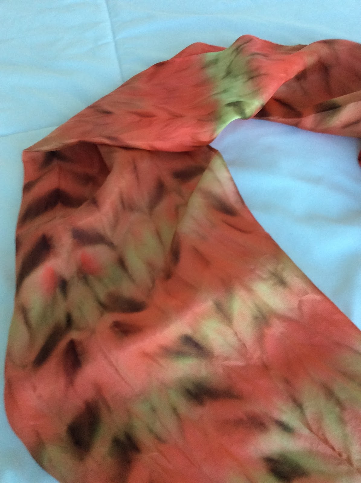
Orange, Red, and Gold Hand-Painted Silk Scarf Using a Shibori Technique


     If I had kept track of the time spent making this 60" x 11" scarf, you might be surprised. It was more complicated than you would guess. This is the first time I have made a scarf using the arashi shibori technique (arashi means "storm" in Japanese--maybe referring to the wavy patterns' resemblance to thin clouds). A library book called Shibori by Elfriede Moller was my guide, although I modified her technique some. Here are a few scarves I made with other kinds of shibori techniques.

     Using a chunky foot-long piece of PVC pipe, I attached the 11" end of the blank white silk scarf near the top with masking tape. The two corners did not overlap; this allowed for just one layer of the scarf to wrap around the pipe. Then, with pale crochet cotton tied around the pipe and secured with tape (this can be done with thicker string or any thread as well), I wound the crochet thread around the scarf on the pipe many times in a random pattern. After a section was wound with thread, it was scrunched up and the next section wound--until the entire length of silk was tightly gathered on the pipe. The tape had to come off so that it did not block the dyes.

Close-up detail
    Tying off the end of the thread, I then wet the silk well so that it was soaked through but not dripping wet. This helps the dye to spread, to blend, and to penetrate the folds. Then, with a dropper and sometimes a brush, I pushed a few colors of French silk dyes into the fabric. The technique allows for many variations; the internet has a number of examples if you'd like to see more. My goal was to color the entire scarf, but other artists leave white areas. The silk can also be folded and then wound onto the pipe. Depending on the pattern of the folding, the wavy stripes can run in more than one direction when the piece is completed (here is one example).
Close-up of the other side

     Once the piece is dry (24 hours or more), you can snip the string or thread and enjoy the big reveal. I used four dye colors, but found that one dominated the resulting scarf. The colors are called grenat (a brownish red), ruby, orange (a blend I made of coral and a bit of yellow), and a sort of gold (a blend of yellow and a bit of rich sienna). As you can see, the coral blend took over many areas--not really surprising since it has proven to be quite strong other times I've used it. Yet, the result did surprise me. So this project was a learning experience and an adventure that will help guide the next time I use the arashi shibori technique.

Question of the day: Do you enjoy experimenting with crafts or other projects--even when you don't know how they will turn out?

Friday, November 30, 2018

Deep Rose and Grey Hand-Painted Silk Scarf--Where Design Ideas Come From

Deep Rose and Grey Scarf before steam setting or removal of the gutta resist
     This 11" x 60" hand-painted silk scarf in deep rose and grey with white outline flower design sold so quickly after I completed the final finishing steps that I only have mid-stage photos. I think that's a happy reason for the lack of a better picture to show you! When the piece was completely finished, the colors were more intense, and the white outlines purer and brighter. 

     I'm often asked where I get ideas for my landscape paintings or hand-painted silk scarves. So, here is the story of the genesis of this scarf design. 

     Each of the scarves I make is a one-of-a-kind original. Although I sometimes adapt a previous design in a new color combination or use a motif from a previous scarf in a new way, there are never two scarves exactly alike. In fact, the nature of the hand-painting process makes creating duplicates impossible. The dye flows or blends differently each time; my free-hand sketching with the gutta resist turns out differently; etc.

     For scarf ideas, I keep a file of pages torn from magazines, catalogs, and other sources to page through to get my creative juices flowing. Sometimes, an unusual leaf or flower in nature or something in one of my own photos sparks a design element idea. I also have notebooks with rough sketches or descriptions of ideas that cross my mind. For this rose and grey scarf design, the initial source was a catalog picture of a black knit top with a large white abstract snowflake outlined on the front. Usually I outline motifs in gutta and fill in with a different color or colors than the background. This is the first time I have "drawn" with gutta resist on the blank white scarf but did not fill in the design to contrast with the background. Instead, the white outline stands out against a solid two-color scarf.

     The grey dye used had recently arrived from my supplier, Dharma Trading Company, with a couple of other new colors I'd ordered, and I was eager to try them. Rather than a single background color like the knit top in the catalog had, I thought I'd make a few bands of grey alternating with cranberry or burgundy. Another new color in my order was a darker burgundy with more of a brown undertone than I had expected. So, as I experimented on scrap white silk, I added enough light rose to the burgundy to make a color I liked with the grey.

     So, a new, one-of-a-kind scarf was born. I'll definitely use elements of this design again in other colors, with other motifs, or maybe similar motifs in different sizes or a different layout. Stay tuned. There are always more ideas in my inspiration file and design doodle and thoughts notebooks than there will ever be time to make.

Question of the day: Do you sometimes wonder how ideas for some of your favorite art pieces came about?


Saturday, April 15, 2017

"Falling Leaves" Hand-painted Silk Scarf

"Falling Leaves",  hand-painted silk scarf
     It's spring, but I recently completed a hand-painted silk scarf with an autumn theme and wanted to show it to you. "Falling Leaves" took several months because I was not happy with the way it was turning out and put it away for a time. Once the French silk dye is in the fabric, radical change is not possible--partial modification is the best one can do.

Musings on "failure" in an art project
     
     To be honest, the finished product is still not to my taste. However, I know that it could still be the perfect addition to the right outfit for the right person. 

Close up detail
Close up detail
     So, I refuse to count this scarf as a failure or even to be disappointed in it. For one thing, every art project is a learning experience, and sometimes what can feel like failure has more learning value than a "success". I am still quite new to French silk dye techniques and welcome any opportunity to learn and grow in the art. 

     A second reason comes from the wise words of my acrylic painting mentor, Linda Blondheim. Once, when she was advising me on improving a landscape painting, I had done all that we could think of, and we both still concluded that we didn't like the results. I told her I'd just gesso over it and reuse the canvas. "Oh no, Mary," she said. "This is not an intrinsically bad painting; it's just one you and I don't like a lot. Someone will love it; you wait and see." I've told this story before; that painting sold in a local shop long before others I like much better.

     Oh, in case you are wondering, here's why this scarf will never be a personal favorite (what a ridiculous sales pitch this is turning out to be! not a sales pitch at all--just sharing my thoughts): I had planned the leaf shapes and layout quite carefully and still like them. The background came last, working carefully around the leaves, which had been outlined in a gutta resist to prevent dye flow in or out of the shapes. For some reason, I thought using a couple of colors would look nice and increase the versatility of the scarf as an accessory. Maybe a good idea for some scarves, but for this design, it made for too much going on. In my opinion, that is; others may feel differently, as Linda has taught me to realize

Question of the day: When have you been disappointed in the results of a project only to discover that others like (or even love) the results?

Saturday, March 22, 2014

Silk Painting Classes--a Heavenly Week

     Earlier this month, I took a whole week of silk painting instruction with Donna Kassab at the John C. Campbell Folk School near Murphy, North Carolina (yes, Rosemary guessed the location in her response to the previous post). It was glorious! Given my love of fabrics and color, silk painting is an art form that has intrigued me for some time. So it was a thrill to have an excellent instructor for a week of classes at this top-notch "art camp for grown-ups". Also a treat: my long-suffering husband, Mark, consented to go along and took a beginners class in throwing pots on a pottery wheel.
     We painted on 22" square plain white silk scarves and learned several different techniques for manipulating the dyes and creating designs. The photos here show my husband's favorite scarf--the purple, blue, and turquoise impression of the ocean--and the first scarf I made in the class--bright red-orange hibiscus (or whatever flower they turned out to be) with a soft sea green background. In a wonderful way, the dyes diffuse into the silk, only partially under the painter's control. For some designs, we used a resist called gutta to outline areas, which prevents the dye from crossing the line of gutta. Both of these scarves employed gutta in their creation, though in somewhat different ways. Even with gutta, results can be a delightful surprise; other results, of course, are less delightful, but take the piece in new directions if the painter remains open and flexible. As Donna often reminded us, "There are no mistakes in silk painting--only design changes." 

     Among the 12 or 13 varied classes offered during our week at the Folk School (from blacksmithing to pottery to quilting to mountain-style fiddle playing), our silk painting teacher and my husband's pottery teacher were two of just three instructors who were chosen to give open demonstrations during free time. The group photo shows our teacher, Donna Kassab, explaining the process of painting a silk scarf. Her husband, Magdi (in the cap), who helped Donna and our class members every step of the way, and my husband (in the charcoal grey fleece) are among those watching the demonstration. Note the frame Magdi made, on which the silk scarf is stretched and elevated for the painting process; the above photos of my scarves were taken while the pieces were still on the frame to dry. Once the scarves are dry, the dyes must be permanently set by a steaming process (a separate, chemical process removes the gutta, when used). For Donna's demonstration, all of the silk painting students had hung the pieces we had made to that point around the room, as you can see in the photo of a bulletin board.


     In future posts, I will tell you more about the equipment, dyes, and processes we learned and show you more of the scarves we made. There is also much more to tell you about the John C. Campbell Folk School.

Question of the day:  Let's dream a little: If you had the time, resources, and energy to go anywhere for a creative or other learning adventure, what would you do?

Wednesday, August 31, 2016

Hand-painted Rose, Purple, and Blue Silk Scarf

     I have almost completed 3 more hand-painted silk scarves, all 60" X 11", a nice all-purpose length to tie and wear in multiple ways. This particular scarf was painted without resist, so the dyes were free to flow. I will show you the other new scarves, which did involve using resist to create designs, in coming weeks. For a couple of other examples painted without resist, see this previous post.

Another view, same scarf
     Sometimes, I purposely allow for the unpredictable jagged edges that can form where two different colors come together (especially if one is already dry), which often create beautiful, sometimes unexpected patterns. You can see such edges in the apricot/green 21" square scarf pictured below. 

Professional fabric steamer, about 42" long
     However, I decided to minimize those kinds of edges in this design. One can achieve subtler, smoother color transitions by working very quickly and rubbing adjoining areas with a paper towel. Or, as in this design, one can work wet-on-wet, spraying the white scarf with water before adding colors. For this scarf, I painted the dyes on a wet scarf blank. I experimented with colors and techniques, intending to gradually build up colors to a darker level. Then, the softer, pale colors appealed to me, especially after my friend agreed, saying "It looks like Spring". So, I decided to declare the scarf complete. 

Example of the jagged edges resulting from painting on dry scarf with no blending
     The final step is to steam-set the colors. Many fabric dyes can be set with a steam iron, and some set instantly when painted onto fabrics. But the loveliest and most intense colors, in my view, result from the French-type silk dyes, which must be set in a steamer--either purchased or created by the artist. My generous husband gave me a professional fabric steamer for Christmas--see photo--which greatly simplifies the process (although it is still painstaking and requires several hours altogether). If any of you request more information about the steaming process, I will post more detail in the future.

     Making this scarf was fun. I had only a simple sketch with the idea of color areas and a plan for the dye colors I would use (some straight from the bottle, others mixed for the desired hue). From there, I just spread color freely on the wet silk and watched the design develop--now and then blending the areas where colors came together with a large wet brush or a paper towel. Finally, I brushed on some additional soft contrast strokes and shapes.

Question of the day: In pursuing a hobby or interest, do you prefer trying new techniques and styles or polishing and perfecting your favorite approach?

Monday, December 8, 2014

Around the World Blog Hop Entry--My Creative Process

   
Outside a back yard at Jacksonville Beach, FL
I was invited to join an Around the World Blog Hop (google that and be amazed!) by fellow artist Mary Paquet, whose work and blog I always enjoy and admire. Please visit Mary Paquet's blog to see for yourselves and for her Blog Hop entry on December 1. In turn, I have invited Jo Castillo, a delightful, talented artist and prolific blogger to post on Monday, December 15. All the past blog hop entries I have visited are fascinating as a variety of artists each answer four questions about their work and creative process.

     The invitation is welcome both because 1) I am a relatively new artist and 2) my blog is a mix of posts about both acrylic landscape painting and silk scarf painting AND lots of other aspects of creative living, including travel, cooking, exploring coastal North Florida, and more. I am honored that more established artists with more art-focused blogs to include mine. Thank you, Mary Paquet. My thoughts on the questions appear below (and, to spare you a truly endless post this time, will continue in a second post in a few days). Here and there a link will take interested readers to related posts on this blog. 

1) What am I working on? After a break from art due to travel, time with family and, well, the rest of life, I have several projects going now:
Matanzas River Bend
  • finishing touches on a gift for a friend--a 12" x 6" piece picturing a Matanzas River scene, just off the Atlantic Ocean. My friend has always loved the Matanzas Inlet area, near St. Augustine, Florida.
  • deciding what's next on a half-finished silk scarf with a purple iris motif; it needs more tonal contrast and/or some other revision (not pictured--stay tuned).
  • designing and making a scarf for a friend who wants it as a Christmas gift for someone special to her. She has a color scheme idea, and is trusting me for the rest. How scary is that?
  • A favorite scarf, painted in March
  • Finally, something new for me, planning a couple of paintings based on photos and memories of a recent time in Tuscany. Normally, I interpret scenes here in coastal North Florida because I know this area in depth. Can I capture the essence of a place only visited? Perhaps not, but I am hoping to convey my own impressions and appreciation of its beauty.
2) How does my work differ from others of its genre? Most bloggers, including me, regard this question as a stumper--hard to answer for oneself. Even some relative strangers have said that once they see a landscape I've painted, they recognize others as being my style, so the work does have distinctive elements. However, defining those elements is difficult. I'll mention a few common threads in most of the landscapes. Making scarves is simply too new for me to have developed a personal style; "experimenting" is the current mode in silk painting. (See posts on the week-long "art camp" silk painting class I enjoyed).  My landscape paintings usually include:
Another silk scarf favorite

  • A realistic style--although I "edit" actual scenes for good composition; they are far from photographic.
  • Many portray out-of-the way places that most people would pass without noticing. Prowling back roads, urban pocket parks, and nature preserves with my camera, I find quiet charm and beauty--painting ideas abound.
  • Water appears in a fair number of works. Here in Jacksonville, Florida, we enjoy the Atlantic Ocean (from a surprising variety of beaches), the mighty St. Johns River and a number of other rivers, quirky creeks (some of which would be called rivers in other regions--they are wide!), still ponds, and our bewitching, ever-changing salt marshes. I love both being near natural bodies of water and the challenge of painting water.
  • Marsh in Fort Caroline Preserve
  • Finally, the works reflect an effort to establish a clear focal point and visual path for the viewer.
Clear focal point, "Summer Reflections" 
3) Why do I create what I do?

4) How does my creating process work?

This post is long enough, so--hoping the blog hop police won't mind--I will post again in a few days with consideration of the last two questions.

   Don't forget to visit the delightful blog of fine artist Jo Castillo, who has agreed to be "tagged" as the next Monday blogger in this creative chain. Don't miss her post on December 15! 

Again, I am truly thankful to Mary Paquet for providing this opportunity. Given the many incredible blogs I have discovered following the chain from one creator to another, it took real self-discipline to stop browsing and post on time :).


Question of the Day: What are some delightful discoveries of people/ideas/visuals/blogs you have encountered recently as you browse the web?    

Monday, April 7, 2014

Painting Silk Scarves Without Using a Resist Agent

     The two silk scarves pictured today are among several I made at "art camp". These two have been especially usable and fun to wear; they each coordinate with many outfits and brighten neutral-toned tops. Changing the corner that shows or tying the scarf in different ways features various colors according to whatever section of the scarf best complements an outfit.


     I did not use any resist agent to control the flow of dye in these two pieces. In other words, the dye was brushed straight onto the unpainted silk scarf and allowed to diffuse and spread naturally. Each stroke blends with other dye colors that have been brushed near them, often creating unplanned effects and varied edges (some jagged-looking, some smoother). These effects are delightful to watch and are both fun and challenging to work with in silk painting design. The rest of the post describes the painting process--including the use of salt and alcohol for special effects--for interested readers.

     The multi-colored scarf with yellows, oranges, and reds predominating evolved from my original plan to a somewhat different design. After blending each of the dye colors I wanted to use (in small cups), I began to brush the gorgeous colors in strips from the edge of the scarf toward the center. As you can see in the photo below, I did not bring the colors all the way to the center at first. To deepen the colors, I painted over some areas again once they were dry--sometimes with the same color, sometimes blending in another color. Then, as the final version of the strips of color dried, classmates began to comment on the design, calling it "like fire" or "fireworks". So, I went with that, rather than with the autumn theme in my mind (don't ask--it would be boring to try to explain). I completed the center with a burst of "fire", taking advantage of an interesting property of yellow dye. As our teacher, Donna Kassab, had shown us, yellow dye (who knows why) tends to "push" other colors back a bit in the silk. The yellow and yellow-orange blend in the center performed their magic and created an interesting jagged edge in the process. A bit of salt created some variation in the center (see next paragraph for more on using salt). Fun stuff!


     The green and blue scarf went even more quickly. I brushed the entire scarf with slightly varied green tones as a background. Once that was dry, I began in the center with ultramarine blue and brushed a large spiral shape (leaving a fair amount of open space). Then, I brushed shades of turquoise next to the blue, again leaving some space for the background green to show. Finally, for the "special effects"  of spots and mottling you see, I sprinkled the wet surface with table salt and some chunky sea salt here and there for variety. Lightly spraying alcohol from a couple of different angles completed the piece. Both the salt and alcohol continue to work until the silk is completely dry, either drawing the dye in (salt) or repelling it (alcohol drops). So again, the process took on a life of its own, partly unexpected, although--since I had some experience with the materials by that time--partly as I had hoped and expected.

Question of the day: Do you prefer creative processes over which you (at least mostly) exert some control, or do you enjoy using media which to some degree, drive the creation in unexpected directions?