Showing posts sorted by relevance for query look to the hills. Sort by date Show all posts

Wednesday, January 27, 2010

Growing--Two Versions of a Landscape--New York Hills Painting

This pair of paintings represents a rare undertaking for me--creating a second version of a landscape I had already painted once. You have seen the painting on the right before, on the November 5 blog post, along with the following description: " . . . Look to the Hills, II, recalls a deeply renewing visit to Warwick Conference Center near Warwick, NY a few Octobers ago. Our long-time friends, Ken and Arlene Tenckinck, manage the center and direct all its programs. As I type this, I find myself smiling and breathing deeply with pleasure--they are remarkable people, Our too-infrequent times together are always rich, meaningful, and full of laughter."
The original Look to the Hills painting, on the left above, differs in the painting palette, in the appearance of the large tree, and in the degree of detail developed in various areas of the composition. It remains a personal favorite as a reminder of that wonderful visit with treasured friends and for the tranquil feeling it gives me. Although I am open to selling most of the paintings I currently have on hand, I plan to keep the first version of this scene.
Why did I decide to create another painting from the same reference photos? I guess part of the reason is the attachment I feel to this scene. I also like an occasional break from Coastal North Florida scenes and felt like a return to the mountain vista of the Warwick, New York area. Finally, I was curious to try a second version with a different palette, a more limited group of basic paint colors from which I mixed all the colors you see in version II.
There may be some truth to the saying that "You can't go home again", as the second version proved to be much more difficult than the first. It simply refused to come out well and is still a distant second to the first in my opinion. However, hearing the response of other people to the two pieces has been interesting and instructive. At my Open Studio Reception in November, several guests really liked Hills II , and at least one of them is still considering purchasing it. Their opinions serve as a good reminder that taste and preference in art are very individual and that I should not assume that viewers will always rank paintings the same way I do. If any of you want to vote for one or the other, that would be fun, and I would love to hear the reasons for your preference.
Question of the day: What experiences can you recall that illustrate the wide variation among people in their taste in art?

Monday, April 29, 2019

How to Create Depth in Landscape Painting, Part I--Atmospheric Perspective

"Look to the Hills",  demonstrating atmospheric perspective
     Atmospheric perspective in landscape painting is one tool artists have to create the illusion of depth on a flat surface. Using this tool well requires careful observation of subtle differences in color, contrast, and sharpness of objects as we see through the atmosphere from near to far. 

     No, it is not really complicated. Think about a time you could see a great distance into a scene with hills or mountains. The furthest ridges appeared bluer (or maybe a bluish purple) compared to near ridges as well as having softer edges (looking "fuzzier"). In general, colors become cooler as distance from the viewer increases, dark/light contrast lessens, and edges soften. A landscape artist needs to consider all these qualities carefully.

     I almost always paint from my own photos (as well as using field notes and sketches), but I have discovered that photos seldom show atmospheric perspective well. It is up to me to create that perspective as I paint. Merely copying a photo is unlikely to be effective in creating depth.
"On the Jones Creek Trail"

     Also called aerial perspective (although it has to do with looking through the air and whatever is in it, not at all with a bird's eye view), atmospheric perspective rendered well will make a stunning difference in your work. To create realistic looking depth, artists often exaggerate these effects.

     I am absolutely not an expert, but will show you a few paintings to illustrate my efforts at creating depth. "Look to the Hills", shown top right, pictures a favorite place near Warwick, New York with a long view into the distance. Notice that even though the distant foothills are heavily wooded, they don't look very green. Rather, they are a neutral sort of bluish shade with minimal appearance of contrast. Also, the far side of the valley is blurred and muted in color and tone, becoming a bit brighter and more defined nearer to the viewer. The trees, chair, and grasses closest to the viewer have sharper edges, more intense color, and greater light/dark contrast.

     "On the Jones Creek Trail" presents a different sort of challenge; the viewer cannot see very far because of heavy foliage. Here, you can see that I have definitely exaggerated the effects of atmospheric perspective to create several visual planes and to avoid a flat look. In my next post, I will describe some specific techniques I use with acrylics to paint landscapes with the appearance of depth.

Question of the day: Are you interested in descriptions of artists' techniques? What else would you like to hear about perspective?

Wednesday, December 8, 2010

Growing--A New Home for a Painting, a Surprise Sale

"Look to the Hills", one of two versions of a lovely view at a conference center in Warwick, New York, has been displayed at Trends Home Decor on Hendricks Avenue in Jacksonville, Florida, for several months. Some of you may recall a post several months ago about the two versions I painted of this scene, based on a peaceful, renewing place we love. On Saturday, I phoned Lori Taylor, the Trends shop owner, a very sweet person and wonderful supporter of her artists, offering to bring in a new piece ("Spring Breeze", a Jacksonville Beach scene finished and posted on this blog a couple of months ago). Knowing that she has mounted an "angel wall" of special pieces for the season and that the shop is fairly full, I suggested that I could take one of my other paintings home for awhile to make room for the new one. That worked for her. A note: you can use the search box in the upper left corner of this blog to enter terms like "Trends Home Decor", "Look to the Hills", "Spring Breeze" or "paintings" for more photos and information.
She had decided to keep the Florida scenes I was showing in her shop and to rotate this New York landscape out for awhile, so we took it down. I set it aside on a chair while we chatted. Then, a couple came in to ask her about buying two brightly painted Adirondack chairs displayed out front (she sells unique home accessories and furniture in addition to moderately priced original art works). The woman came in to browse while her husband arranged payment, and she spotted my painting propped sideways on a chair. "Oh, I love that!" she said, "Don't tell me you just bought it, and I missed out." I was happy to say that is was still for sale, and we began to talk. Discovering I was the artist who painted "Look to the Hills", she described what it meant to her in more detail, how peaceful she felt it was, and how well it would fit in their bedroom.
Talk about serendipity! The pleasure of meeting the couple who took this piece home and of hearing how it spoke to them was delightful. And if I had taken it straight home instead of chatting with Lori for awhile, we would have missed each other, and that particular piece would not have found its new home.
Question of the day: Where would we be without the occasional perfectly magical connections and moments that sparkle in otherwise ordinary days?

Friday, May 31, 2019

How to Create Depth in Landscape Paintings, Part II--Tips and Techniques

"Summer Reflections"
     Our previous post discussed some principles of atmospheric perspective. This time, a few tips about achieving it in a landscape painting and other techniques for creating the appearance of depth. You may be surprised by the degree to which careful planning and analysis can be involved in painting.

     One technique I learned from my painting mentor Linda Blondheim is the use of glazes. I think glazes are particularly useful in acrylic painting because acrylic hues are usually quite sharp and clear. Distant elements in a scene should look hazy, a bit "fuzzy", and have a pale, cool hue. 

     Although I try to begin with appropriate soft tones in the background, they often need to be pushed further back visually. Acrylic glazing liquid is useful for this. Depending on the size of the area that needs to be modified, mix a puddle of acrylic glazing liquid with just a touch of blue, purple, or even soft aqua paint. After mixing it well, use a soft brush to stroke it across the area that needs softening, blending out the edges a bit so as to avoid an obvious line. Don't worry if it looks too muted or cloudy; it will usually be fine when dry. Let the area dry well (this will take somewhat longer than normal acrylic paint drying time). You can repeat the process with another layer or two until you are satisfied with the result. 

     The far background of the painting " Summer Reflections" was treated this way, and the tree just to the left of the center was also pushed back, but less dramatically (just one layer was enough to help that tree recede). The painting I showed you last time, "Look to the Hills" was painted before I knew about glazes. I remember finding it difficult to handle the distant hills, probably scrubbing on bluish purple mixed with lots of titanium white to produce that hazy appearance of distance. 
A study of a marsh scene

     The relative size of objects in a scene also helps define distance. Your eye may be better than mine, but I have discovered that I sometimes tend to make far away objects larger on canvas than they should be. Since I work from reference photos, I sometimes actually measure something on the photo, then use a proportion (oh no! math!) to translate that to my canvas. For example, if the photo is 4" vertically, and my canvas is 16" vertically, a far line of trees that is about 1/4" tall on the photo would only be about 1" tall on the canvas if I wanted to keep precisely the same proportions. 

     Of course, I do not duplicate the reference photo and am not bound by precise numbers and proportions. The exercise of measuring simply serves as an aid and a suggestion as I work, which is open to change if the result doesn't look right. A study of a marsh (pictured here) which I painted early in my art journey was a combination of a little measuring and lots of free-styling. Artistic license is alive and well in my studio--alongside some analytic thinking.

Question of the day: Do you think that planning, analyzing, and measuring are compatible with creativity?


Sunday, September 16, 2012

Favorite Paintings from 2007 and 2008

     Thinking back on the relatively few years I have been painting, I browsed the photo file, viewing earlier works, and spent some time feeling grateful for this rewarding pursuit. A few favorite early paintings stood out, although each and every piece has some interesting features, and each represents creative learning and growing experiences.

     About nine years ago, a week-long painting course at the John C. Campbell Folk School in North Carolina awakened a whole new pleasurable undertaking for me. I had expected to relax, stretch my mostly analytical mind beyond its comfort level, have fun making some messes, and come home refreshed. Well, with an excellent teacher, all my expectations were met--except one. The paintings were not total messes at all. Not that they were great art, but they were pleasing to me beyond anything I had ever thought possible.


     Since then, I have learned much more and refined my painting skills with occasional local classes, guidance from my painting mentor, Linda Blondheim, and lots of practice. Painting is a whole new, unexpected source of joy.

     So, as I looked back, I  found three photos to show you, each representing a particularly pleasing achievement for me. Each work has elements I would do differently today, but they were the best I could do at the time, and that's good enough. No need to be overly self-critical about them (or to whine to you about the short-comings I see in them now). 

     It's interesting how differently artists view their own earlier work. In one painting class, a very good teacher said that she sometimes cringed when she saw some of the paintings she had sold years ago. She was somewhat ashamed of those earlier works. That seems a pity; clearly they appealed to the buyers (and probably to others). Further, regardless of other peoples' opinions, they represent a stage in her creative journey which contributed to where she is now. Linda Blondheim's attitude strikes me as healthier and more self-affirming; she enjoys looking back and values every one of her paintings, convinced that each was the best she could do at the time.

     So, without apologies, here are three personal favorites from 2007 and 2008. For each, clicking on the link will pull up an earlier post describing their creation in more detail. "Look to the Hills", an 18" x 24" landscape, interprets a meaningful visit to a retreat center in Warwick, New York. The 12" x 16" marsh scene recalls a delightful day kayaking with my husband and one son (and later became an engagement gift for our son and his fiancee). The 9" x 12" "Magnolia on Purple" was based on photos of magnolia blossoms on some neighbors' trees. Each work brought frustration as I confronted its challenges, and each was a significant learning adventure. 

     Life's journey is always surprising--what if I had listened to my conviction that I had zero artistic ability?--what if I had never tried painting? By the way, I also value other less successful (or even totally bungled) ventures along my journey for the contribution they have made to the person I am today.
Question of the day: What surprising discovery have you made about your own abilities?

Tuesday, May 12, 2020

Westward Ho! Yellowstone's Mammoth Hot Springs and Terraces

     A cabin at Mammoth Hot Springs was our second "home" in Yellowstone National Park. The cabins (and newly refurbished hotel) are part of a hub toward the northwest corner of this huge park. The hot springs and extensive natural travertine terraces formed from dissolved limestone are fascinating. Over a mile of boardwalks allow visitors to explore them safely. Our day for exploring them and other nearby thermal features was chilly, grey and sometimes forbidding looking, so my photos show a completely different reality from the gleaming, pearly look of the terraces in bright weather. Of course, you can click on any photo to enlarge it.


     The Mammoth region is home to some of the largest herds of elk in the park as well as a variety of other wildlife. We had seen a few female elk in meadows in other parts of the park, but we were not expecting the number of elk we could watch in Mammoth. Nor were we prepared for the degree to which we saw some of them "up close and personal". We had been as careful as possible to stay the recommended distance away from wildlife, but in our cluster of cabins, the elk came to within eight feet of us. Between six and eight does and yearlings regularly grazed on the green grass the cabins surrounded--guess it was sweeter than the sagebrush on the hills around us. A number of others settled in around the cabins--one large doe even blocking access to our rented vehicle for awhile one morning. 

      Since we visited in elk rutting season, we could hear the bucks' eerie high-pitched bugling at night. Several bucks were gathering harems in the area--one group hanging out often in Mammoth Village (cluster of ranger station, camp store, hotel, restaurants, etc.). Cars stopped, and some people came much closer than was safe to get the perfect photo--a challenge for the rangers to manage.

     I have been puzzling over how to adequately express our awe and fascination with the natural wonders of the Grand Tetons and Yellowstone. We are thankful to have had the opportunity to spend some time there. Since we were already near the Northern edge of the park, I had arranged for us to fly out of Bozeman, MT rather than drive all the way back to Jackson, WY. Oh my, we wished we had had a few more days in Bozeman as well. It's a hip, cultured college town surrounded by breathtaking mountains. After a quick lunch and stroll in town, we visited the amazing Museum of the Rockies, arriving just in time for a visiting production of Mongolian music and dance in dazzling costumes. The accompanying extensive exhibit featuring Ghengis Khan was eye-opening. I had not known that the fierce, brutal warrior became a progressive (for that time) leader. The museum's permanent exhibits include a stunning variety of local dinosaur finds and Native American art.

     Our itinerary worked well for us. We appreciated our time in Jackson, WY, and thrilled to the Grand Tetons. We were glad we had reserved rooms in two different corners of Yellowstone's expanse so that we could visit varied areas and features in a leisurely way without driving greater distances. You can view previous posts about our trip here. I hope you have the same opportunity some day.

Question of the day: Can you sometimes recall particular travel moments and experiences as vividly as if they had happened that day?

Friday, October 30, 2015

Favorite Paintings--When to Keep, When to Sell

"Summer Reflections" 18" x 24" in acrylic
     Every painting is a valuable learning experience, but some emerge as personal favorites. (Note that each photo caption is a link to earlier blog posts about that painting if you are interested in more background on any piece.) 

     Since we have down-sized our home in retirement and already have some treasured wall art, we have limited space for new pieces. If none of my babies left home, they would pile up under the bed and beyond, even though I am a slow painter with limited output. So, it has been delightful for me to connect with people who value a particular piece enough to purchase it. I have also enjoyed giving paintings as gifts--something I do carefully and only when I know for certain the recipient likes the work. 
"Castaway Island Cedars" 9" x 12" in acrylic

     However, a few particular paintings would be difficult to part with. They are not necessarily my best work; in fact some represent a creative struggle with a composition that stubbornly refused to come together for a time. Others feel like markers of growth and may have flaws or elements I would do differently now. My wonderful mentor, Linda Blondheim, taught me to value them all--from the earliest, awkward efforts on--because they represent the best I could create at the time.


"Look to the Hills, I" 18" x 24" in acrylic
     In a recent post, I showed you a painting called, "Hanna Park Heron", which found a wonderful home, but which I miss at times. Today's works are (at least for now) definitely not for sale. 

     Other artists (including the real professionals) seem to have varied viewpoints on keeping versus selling artwork. I have heard some say that "everything is for sale" and that it's foolish to hang on to anything, while others treasure certain works in what is often called "the collection of the artist". Of course, I am a simple hobbyist (though a serious one) and am fortunate not to have to make a living through my art (which would be a pitiful living, indeed!). That leaves me freer to choose what and when to sell.

     Why these three? The first is from 2014 and just pleases me no end; I particularly like the clear focal point, feeling of depth, and optimistic mood. The second is from a walk in a favorite preserve and feels serene and very typical of North Florida. The third is an earlier work, inspired by our 2006 revisiting of a lovely retreat center in New York and the memorable time we spent there with precious friends.

Question of the day: What special objects are your "keepers"--whether or not you made them?


Thursday, November 5, 2009

Growing--Art Studio Reception Preparations Continue

We are very excited as we prepare for our Open Studio Reception this coming Sunday afternoon. If you can make it, we would be thrilled to see you. This painting will be one of those on exhibit. The specifics once more:
North Florida Landscape Paintings
by Mary Lemmenes
Sunday, November 8
2:00 - 5:00 PM
7364 Secret Woods Drive
Jacksonville, FL 32216
Fresh organically grown produce from Down To Earth Farm
Live Piano by Greg Spiess
Food & Drink--Casual Dress
For information:
lemmeneslandscape@bellsouth.net or
904-945-0458 UPDATE: I have now added an index of all blog posts about planning and holding an art reception. Access it here.

Although a number of tasks are complete, there are still plenty of details to attend to in the next few days. Mounting a show in our home poses interesting challenges. Besides labeling and displaying the paintings, setting up the business end of things, preparing everything from guest book to drinks and food (the latter will be relatively simple for this event), the most challenging aspect of preparation is that after sending out a number of invitations, we have no idea how many people to expect. I think it will be somewhere between 10 and 150. An interesting adventure, no?
The painting pictured above on my studio easel, Look to the Hills, II, recalls a deeply renewing visit to Warwick Conference Center near Warwick, NY a few Octobers ago. Our long-time friends, Ken and Arlene Tenckinck, manage the center and direct all its programs. As I type this, I find myself smiling and breathing deeply with pleasure--they are remarkable people, Our too-infrequent times together are always rich, meaningful, and full of laughter.
I am hoping that family and friends will take some pictures of Sunday's event so that I'll be able to share them with you next week. In the fun and stress of the countdown, I am encouraged and buoyed up by the support of all of you, dear readers and fellow bloggers. Thank you, thank you.
Question of the day: What recent avenue for sharing your creative projects or thoughts has been especially meaningful for you?

Monday, August 5, 2013

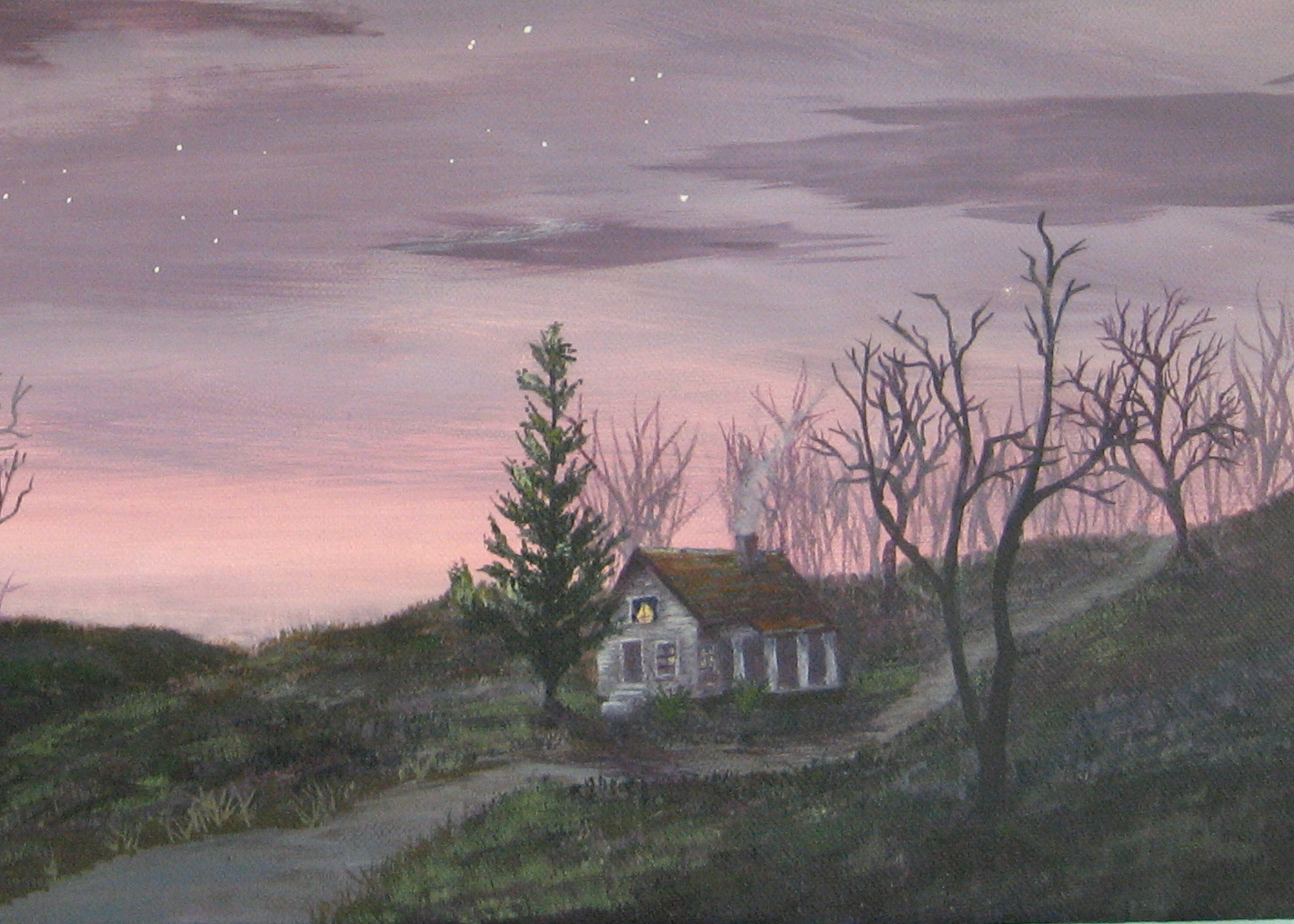
A Quiet Night Scene Painting--"November Moon"

     
     For a change from local North Florida locations, I tried this night scene, somewhere in Midwestern rolling hills in November before snow has fallen. There were spots like this near the western Michigan city where I grew up, but the scene is not specific to a certain place. Sorry the photo is a bit blurred, but my clearer ones were not at all true to the colors in the piece.
     "November Moon" was inspired by my favorite PBS painting show with instructor Jerry Yarnell. Yarnell paints beautifully in acrylics and provides detailed, extremely helpful step-by-step instruction for well-developed paintings, each completed over several episodes. I learn more from Yarnell's approach and techniques than from the quick, done-in-one-show paintings on some other shows (although one of them was the source of my original feeling a few years ago that, "Maybe I could paint"). 
     I don't ever copy a painting by another painter, and in this case, simply adapted the background of Yarnell's piece with my own trees, road, house, and other details. I tried the hues in his palette which differ from combinations I've used before, but blended them my own way. After his introductory session I was not able to see the subsequent episodes (fortunately I think), so went off in my own direction. He completed his version with a twisted dead tree and some geese in flight (not a house, pine tree, or road).
     The work went fairly quickly and was fun to create. A close-up detail (the colors are not as light as they look in the close-up photo) shows the cozy house on a country lane one November night (As always, click on any photo for a larger view).
Question of the day: Are you also fans of Public TV and Radio and their affiliates (like the Create channel).?