Showing posts with label limited palette. Show all posts

Wednesday, October 31, 2018

Two Beach Paintings--Two Different Palettes

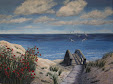
"Early Spring Dune"
     Artist's choice of color, color temperature, and palette are significant factors in the mood and overall impression of a painting on the viewer. These two acrylic beach paintings are both based on observation and reference photos from Jacksonville Beach on the Atlantic in Northeast Florida. Yet, they evoke different feelings, at least partly because of different color palettes. My style, an interpretive realism, does not attempt to copy what I see, but to represent my feeling and impression of the natural scene, so I sometimes modify colors.

     When I first began painting, I tested colors and color combinations but did not restrict the palette for a given work. I chose tube colors and various blends of those colors according to the scene and my inclination. Later, when I learned to limit the palette for each work, the results were much more unified, cohesive, and pleasing (at least to me).

     The first painting, "Early Spring Dune" with a view outside the white wall of an oceanfront home and yard, has stronger, clearer, warmer hues, as well as sharper edges than the second. The palette included: Cerulean blue, Paynes grey (which is bluish), Sap green, cadmium red deep, burnt sienna, Naples yellow, buff, white, and a touch of black in a few shadow mixes.


"Sea Oats"
     In the second piece, "Sea Oats", a softer light glows from a partly cloudy sky later in the day. Considerable artistic license inspired this palette because the reference photo was taken on such a grey day that it almost looks like a black and white print. Memories of mature sea oats at different times of outdoor study informed my color choices. The palette for this work included: cobalt blue, Paynes grey, permanent rose, yellow ochre, burnt umber, buff, white, and a bit of black. The hues were softened by blending some with their complements or with gentle neutrals. You may notice that the blue and yellow chosen are cooler than those for "Early Spring Dune". Using permanent rose was a mistake for this piece, by the way; although a lovely shade, it is strong and can be difficult to handle. Regarding the choice as a learning opportunity, I blended the rose into submission, practicing on heavy art paper until the result worked.

     Same off-shore island, different paintings. You may prefer one or the other, but I enjoy exploring a range of palettes and always keep a record of each painting's palette in the file with my reference photos, sketches, and a photo of the completed painting. Those files have sparked many new adaptations of previously used palettes.

Question of the day: What differences do you notice in your response to the two paintings?      

Wednesday, May 15, 2013

A Third Painting Class Assignment

     We have had a number of painting class assignments since my last post, from painting a row of trees using a random technique designed to loosen our approach, to painting an accurate image in proper perspective of a stucco ranch home. Each class and homework assignment covered a different range of skills and subject matter. This photo shows my most recent completed assignment . 

     For this class, Anthony Whiting brought in copies of a color photo of the well-known "lone cypress" on the Pacific Coast near Monterrey, CA for us to use as a reference for our homework assignment. In class, we began with sketches to determine our particular composition and interpretation of the scene in the photo. Working on the painting on heavy art paper in acrylics at home, I decided to try an under painting method Anthony had suggested at one point--to paint all or major areas of a planned work with the complementary color of the eventual hue. You can see the somewhat garish results below, which is the actual first stage of the homework painting above. I did not use an under painting for the sky area because I wanted to keep it pale and delicate, as it was in our reference photo. 

     One advantage of the complementary under painting here is that the top layer colors really pop against their opposites (orange and yellow under the blue and purple hues in the ocean; purple and grey-blue under the yellow and orange toned rock). In addition, leaving areas where the under painting shows through in the finished work gives the water more movement and a livelier look than painting it only with blues and purples on white paper would have achieved and creates interesting shadows and hollows in the rock. You can click on the image to enlarge it and to see more detail of the under painting peeking through. The palette for the painting itself included ultramarine blue, Paynes grey, burnt sienna, alizarin crimson, Indian yellow, cadmium yellow light, and Titanium white.

     This series of painting classes has been inspiring and helpful for me. Each new assignment and technique provides a learning opportunity, whether or not it seems logical or is within my comfort zone at first. This particular homework assignment yielded particularly pleasing results, and the complementary under painting is a technique I will use again in the future.

Question of the day: When you view visual art works, how great a factor is color in your preferences and enjoyment? Do you tend to prefer brighter or more subdued hues, contrasting or similar colors in the overall piece?

Saturday, April 13, 2013

Painting Class #2 with Anthony Whiting

     The homework exercise for the second painting class with Anthony Whiting was to paint a bowl of fruit. He had suggested we could pull down a reference photo from the internet, but I couldn't find one with the kind of lighting I wanted. So, did it the hard way--set up a bowl of fruit and took some photos. The image to the right shows my finished painting exercise in acrylic paint on 8 1/2" x 11" heavy paper in a bound sketchbook.

     Before painting the fruit, we were to make an outline sketch of the 8 - 12 major shapes in the image, then a 5 value sketch to plan the placement of the lights and darks, and finally some color samples to choose the paint hues we would use. You can see the preliminary exercises page here. I tried my grey scale markers for the value sketch and used 5 of them, from a very light grey to a very dark grey. The markers helped with decisions about placement of values, but did not allow for the kind of subtler shading a pencil sketch can provide. Instead of individual color swatches, I made a couple of choppy stroke blended patches (as in the first class's homework; see previous post). I used a limited primary color palette with only 3 tube colors altogether plus titanium white--alizarin crimson, cadmium yellow medium, and cobalt blue--which created a wide range of color blend possibilities. Limiting the color palette also makes for a pleasing underlying harmony.

     Anthony Whiting's teaching and homework assignments are providing me with new techniques and leading me to real growth. The subjects, brush stroke technique, choppy blending method--and more--are a change for me. And a challenge. Some of what we do for the class is well outside my comfort zone, or, in other words, at the perfect learning edge.

Question of the day: Where is the learning edge in your life currently?


Friday, March 29, 2013

Painting Class #1 with Anthony Whiting

     Looking for inspiration and motivation as well as instruction, I recently started a series of painting classes with Anthony Whiting, a noted Jacksonville artist. The class has been everything I had hoped it would be and is helping me get past a "stuck" feeling in my own work. Since I  never took high school or college  art classes, there are gaps in my knowledge, technique, and ability to create what I have inside. So, I started by attending two of Anthony Whiting's  beginning painting classes--fun and very helpful. Today, you see a color blending exercise from the first class and the completed homework assignment. Soon, I will post the work from the other beginning class I attended. Next week, I will transition into his intermediate class, six two-hour classes for students with some acrylic painting experience.

     The initial two-hour class covered a number of basics listed on a handout. Then, after a demonstration of what Anthony called a "painterly" way to transition from one color to another, we all tried the technique.

     The two color patches show the result of first mixing a range of tones on the palette from white and pale yellow, through greens, to pure blue, then transitioning from white to blue on a sample in choppy, patchy strokes. You can click on the photo to see detail more clearly. Anthony stressed avoiding a smooth blend--instead letting the strokes show. The result is a lively color transition, which achieves a "painterly" blending in the viewer's eyes. Titanium white, cadmium yellow medium, and ultramarine blue are the only tube colors used--all the greens are mixes of yellow, blue, and sometimes white.


     Given my usual smoother blends and more realistic style, this exercise encouraged me to take a looser, less perfectionistic approach, and I really liked learning it. Our homework was to paint a pear using similar choppy strokes, which was more difficult for me than anticipated--a great learning experience. I used the same two colors plus white for the pear, adding burnt sienna for the background and to make grey tones for the shadow and stem by mixing it with the ultramarine blue. You see the sketchbook page at the left and a close-up of the pear above.

     Even though stepping outside my comfort zone is uncomfortable, I always enjoy doing so in a stimulating learning experience. Anthony Whiting is an excellent teacher, effectively encouraging each of us to experiment and learn. This series of classes is exactly what I have been looking for.
Question of the day: Are you also drawn to learning experiences? Do you prefer to try something totally new or to refine your existing skills and talents?

Friday, March 8, 2013

Painting a Water Study--View of Goodby's Creek

     I explored Goodby's Creek, which is a few miles from our north Florida home, and took photos for landscape painting subjects a couple years ago. Recently, I pulled out one of the less dramatic views to paint because the ripples at the edge of the water intrigued me. This 8" x 10" study attempts to capture the feeling of that spot, of overall quietness with gentle, leftover movement in the water from some earlier disturbance.

     Although it is "just a study", not a fully realized painting, this creek view was challenging and required several revisions. I am pleased with the results, with the overall "feel" of the piece. I plan a few minor changes, but wanted to show you this nearly finished stage before coming into a time that will be too busy for any posting.


     For those of you interested in the technical details, the support is a canvas board. The acrylic paint palette included cerulean, cobalt blue, paynes grey, alizarin crimson, cad yellow light, yellow ochre, burnt sienna, buff, and titanium white. Wanting a cleaner look than the actual, quite wild creek bank vegetation, I left out a fair amount and gave the viewer some glimpses of the sky. The painting also increases the light/dark contrasts and highlights the stand of pampas grass and a few other elements. See the original reference photo below for comparison.


Question of the day: Are you inclined to reflect on the features in a scene which interest you and draw you in--or are you more inclined to simply enjoy natural beauty on a feeling level? Or--like me--sometimes one, sometimes the other?

Saturday, August 4, 2012

A Second New Salt Marsh Painting--"Castaway Island Cedars"

     "Castaway Island Cedars" is the second of two paintings begun at a painting workshop with painter/teacher Roger Bansemer. I described the painting process for "Castaway Island Palms" a few posts ago when it was finished. Both are 9" x 12" acrylic works on gallery-wrapped canvas using reference photos and notes from my outing to Castaway Island Preserve on the intracoastal waterway here in Jacksonville, Florida. Each scene shows characteristic North Florida native trees and other vegetation growing in or near salt marsh areas, scenes like those that greeted the first Europeans to step on the shore of what is now Florida.


     With apologies for the slightly washed out look of the palms photo, here is the other painting. As always, you can click on the images to enlarge the view.


     I used the same limited palette for these two scenes so that they could hang harmoniously as companion pieces, but made certain each could also work alone. This palette includes: cerulean blue, ultramarine blue, Payne's grey, cadmium yellow light, Indian yellow, cadmium red light, white, and buff, with some burnt umber in a few of the mixes. As described in the "Castaway Island Palms" post, this is my first experience using Indian yellow, a warm, slightly orangey hue. It's very nice. I rubbed each canvas with an uneven burnt sienna mid-tone before painting, which provides a warm undertone unifying the entire work as well as a base from which it was easy to judge the tones (relative darks and lights) of the rest of the painting. Beginning with what I planned as the darkest darks, then moving to lights and mid-range tones, I laid in the rough shapes of the composition, then gradually worked in greater detail. "Castaway Island Cedars" came together more quickly (or in my case, less slowly :>) than the palms piece.


     For each of these paintings, I had excellent reference photos, including those that showed more detail of the red cedar branches and needle clusters, or other crucial detail areas. Several times in the workshop, Roger Bansemer stressed the importance of starting with well-composed reference photos with adequate tonal variation. Sounds obvious, maybe, but I have begun with so-so photos more than once in the past and then struggled to compensate for a poor composition or monotonal appearance. There is a point beyond which I am not good at "making it up"--especially in trying to add something to the given scene that is not actually there. Some aspects of a scene are fairly simple to adjust. Given the lush, varied vegetation here in coastal North Florida, I inevitably need to leave things out to make a pleasing composition, which is simpler than adding elements. The horizon (which is often near the horizontal center of photos) can be moved easily to avoid cutting the composition in half (much less pleasing to the eye than placing it a third of the way from the top or bottom--or at another less symmetrical level). Beyond that, the fact that these works both came from good, solid reference photos helped me complete them with less stress and difficulty than sometimes.
Question of the day: In visual art (including photography), how often do you think about or notice the placement of various features of the overall composition? Do you know why you are particularly drawn to certain compositions?  

Friday, June 22, 2012

New Salt Marsh Painting--"Castaway Island Palms"

     The first of two 9" x 12" paintings I am working on from my exploration of Castaway Island Preserve might be finished. At least, it is very near finished and is ready to show you. The small palm hammock in the mid-distance across the salt marsh drew me to the scene. Paintings always take on a life of their own, and this one somehow became a bit darker and softer than my original vision, which seems fine. It hangs in my studio where I'll contemplate it occasionally to decide whether or not to make any further adjustments.


     I have been fortunate to have had the advice of two excellent painters on this piece. I began the work in Roger Bansemer's helpful two-day workshop, described in a previous post, and brought it home maybe 2/3 finished. A companion piece, also from a Castaway Island scene, got a rough start there, too--at least in its basic layout--and is now on my easel to be re-engaged.


     Linda Blondheim, my dear friend and mentor--and best painting teacher I have ever studied with--has also advised me as I worked to complete this piece. Given that she lives and works in Gainesville, Florida, a good 75 miles away from Jacksonville, our time together is limited. However, she offers an e-critique service which is extremely well-done. Periodically, I send her images of works in progress and ask questions about them. Her responses are encouraging, insightful, and precise, guiding the process without imposing her own style. She is that rare art teacher whose guidance helps students achieve their own vision to the best of their ability.


     The palette for this painting and its eventual companion piece is: ultramarine blue, cerulean blue, Indian yellow, cadmium yellow light, cadmium red, Payne's grey, buff, and white. This is the first time I have used Indian yellow, an orangy, yet not overly bright blend and enjoyed learning something of its mixing potential. Following Roger Bansemer's practice, I toned the canvas with a rub of burnt sienna before beginning. Once that is rubbed partly off, the resulting background is a mid-tone, which can help the painter judge tonal relationships as she adds first the major dark areas and then the lightest lights, and builds from there. In a departure from my usual technique, I let some of this undertone show through rather than completely covering it with full-strength paint. Handling the light in the scene was tricky, given a day that had been partly cloudy with a somewhat directionless glow and very subtle shadowing. Our weather has been unusually dry here in North Florida until recently; the marsh is undoubtedly much greener and thicker than when I last visited Castaway Island Park. I am reasonably pleased with the way this painting captures the light and mood of the day I was there.
Question of the day: Wouldn't life be sadder and poorer without compatible teachers and mentors?


Thursday, September 8, 2011

Painting Process--My Easel Set-up

Today, you see a typical set-up at my easel. For most paintings, I place an old piece of heavy poster board against the easel behind the canvas so that I can tape things to it for reference. Nearly all my landscape pieces are studio paintings based on actual scenes, so the main reference photos go up on the board first. Below, you see one of the marsh reference photos I am using for these small paintings. The other item you see in this easel photo is a sheet of paper with a couple of quick sketches and other notes. Many of you know that I am a planner, rather than painting completely spontaneously. However, the amount of advance planning varies for different paintings. This is a relatively simple example for a pair of 5" x 7" salt marsh paintings, currently in progress.
In the photo of the sheet of paper, you see that I have done minimal sketching for these pieces. Given their rocky progress to this point, I may have done better to prepare more detailed value studies, planning the balance of lights and darks--but I didn't this time. I also did less in the way of color studies than I might do for larger works, but I did explore some of the possible gold and buff mixes for the dry winter grasses. Notice (learned this the hard way) that I recorded the tube colors used for each mix and also wrote down the colors used for sky and water (though without a sample patch) and the list of tube colors for this particular limited palette. Some artists probably can do with less written down, but I often am working on several pieces at the same time, so one may be set aside for awhile. It definitely helps to have notes about color blends used when I return to a work in progress after some time has passed.
Linda Blondheim, my painting mentor, suggested this blog post topic when I journeyed over to Gainesville, Florida on Saturday for one of her Open Studio Classes. I am thrilled that she is offering this class again; she had stopped for a number of months, and I missed the guidance she offers painters with any work they bring to the gathering. When Linda saw this set-up, she felt that others might like a peek at my typical messy work board. You can find earlier posts on similar topics by entering "painting process" in the blog search box, top left of this blog. The June 28, 2010 post in particular shows the planning materials and easel set-up for a study of a shore bird--somewhat like this board. And, as always, you can click on a photo to enlarge it and see more detail.
Question of the day: What triggers, tools, or processes aid you in creative endeavors (whether "artistic " projects or creative problem solving and everyday living)?

Wednesday, July 13, 2011

Jacksonville Beach Painting Progress--Focus on Sky and Sea

It has finally been possible to get back to the Jacksonville Beach scene I began painting a few weeks ago, a small piece in a panoramic format, 6" X 12". Sky and sea were my main interest in this little study, which I worked to keep quick and minimal. Although the piece is not finished, I wanted to show you its present form. The birds are just quick-sketched in with white and grey tones and need some adjustment. There will be a few other refinements in the clouds, beach sand, and waves, but the basics are all here.
As I mentioned a couple of posts ago, working more quickly was a goal for this piece. I work slowly and include a great deal of detail in my larger paintings--perhaps too much at times. The point of this exercise was to help me fight a tendency to be too fussy and instead to take a breezy, minimal approach, intentionally working in shorter sessions.
The palette is very simple: ultramarine blue, cerulean blue, paynes grey, cad red light, a touch of burnt umber (a warm brown), and titanium white. The top photo shows the entire piece; the other is a detail shot. This has been a satisfying study, and I am looking forward to more exercises in a breezier style in the future as well as to planning some larger paintings in my more typical style.
Question of the day: Are you trying something at least a little new and different this summer?

Friday, May 6, 2011

Details of New Painting and More About the Painting Process

The Lyons Club Park Boardwalk painting got off to a decent start in terms of composition, but some other aspects of the process were unsatisfactory at first and required revision. For those of you interested in the painting process, that is the topic today. The photos are close-up detail shots of the new painting I showed you last time as well as a photo of the entire piece.
As I mentioned last post, I shifted the viewpoint a bit from the reference photo, but you could see that I retained the basic elements of the scene without radical change. I raised the horizon line, which often seems to land in the horizontal center of my photos, because a painting should (almost) never be cut in half by a major element or line. I made small, grey-tone sketches of several possible compositions to consider and gridded over them horizontally and vertically into thirds (resulting in nine smaller rectangles). I try to place my focal point near the intersection of two of these lines, which is pleasing to the eye (these are sometimes called "sweet spots"). In this piece, I regard the center of interest as the area in the upper left third where a single tree stands and the boardwalk comes to a point and makes a sharp turn to follow the river bank. That is such a compelling angle that the viewer's eye is inevitably led there. But I include a path over to the right and then visual paths up, down, and around so that the viewer's eye will naturally move through the entire composition and find other areas of visual interest as well.
I thought I had chosen a perfect palette for this painting, but needed to change it along the way. I use a limited palette for each work, meaning a selection of certain tube colors which will blend well to create the entire range of color variations for the scene. Even though the viewer may not notice the use of a limited palette, the result is more pleasing and harmonious than using many randomly chosen colors would be. The palette I choose varies with the subject, weather, and season. This painting has no tube green at all; greens are blended from blues and yellows, and modified with red, purple and grey. After one change, the final palette consisted of cerulean blue, cobalt blue, paynes grey, dioxizine purple, cadmium yellow light, yellow ochre, cadmium red light, buff, and white. Although the photo is almost entirely in greens and blues, I wanted a livelier scene and added shades of purple in the water. Then, I used burnt sienna (a favorite color) to add a range of tones in the marsh grasses. This was a mistake, in my opinion. The burnt sienna did not blend well with the blues and purples I had used, so I put it back in the drawer and experimented with other shades for the grass. Some of our North Florida marsh areas include a sort of brownish burgundy grass that seemed likely to fit in, so I worked that into various spots in the grass along with some buff and greenish blends. This particular burgundy is a blend of cad red light, paynes grey, and a little purple (used with care--the purple is strong).
This painting came together a bit more quickly than sometimes (I am a sloooow painter). If you have any other questions about the painting process, please feel free to ask either in a comment or to email me (see profile for address). I enjoy sharing "shop talk" with interested readers.
Question of the day: What aspects of the painting process (if any) are of interest to you?

Wednesday, July 21, 2010

Growing--Painting Process--Using a Limited Palette

When I first started painting, I used whatever paint colors I thought would best mimic the actual landscape that was my subject or sometimes used my "artistic license" to attempt to improve on nature, choosing whatever colors I wanted. Although this approach can work, and some of those pieces turned out well, I have been more pleased with the results of using a so-called "limited palette" approach. That means using just certain selected paint colors throughout one painting. Two happy results of this change were that the pieces seemed to have better internal unity and were more pleasing to the eye (in my opinion) and secondly, that I discovered a tremendous power and range in color blends. Even a limited palette can produce amazing variety in color and tone. Rich neutrals result from combinations of opposites on the color wheel, like producing an earthy, warm brown from mixing red and green (which can be varied with different reds or greens from the tube) or like the range of lively greys emerging from purple/yellow or blue/orange combos. Alternatively, one can use the opposite (complementary) color in small amounts to soften a tube color. For example, a too-strong blue for painting a realistic sky color can be knocked back with the right orange, or even with a few drops of burnt sienna.
The painting in today's photo shows early spring wildflowers at Jacksonville Beach against a white fence, photographed near an oceanfront home. A dear friend purchased the painting at my Open Studio Reception this past November, so I visit it often. The other photo shows some of the palette experimentation and notes that led to the palette used for the piece. Other color combos I tried and rejected for this particular painting are saved in a file for possible future use. The colors used here are cerulean blue, paynes grey (which is also bluish), sap green, cadmium red deep, burnt sienna, Naples yellow, buff, black, and white, with a touch of orange added later for bright highlights in the flowers. This May, I started a second painting from the same set of beach photos, one which includes a nearby bridge over the protected dunes down to the beach, and am using this identical palette again. If some of you are interested in this topic, I will include palette details in an occasional future post showing paintings. Please let me know what you think.
Question of the day: I think I have asked this before, but can't resist again--where would be without color in our world?

Monday, June 28, 2010

Learning--Planning Stages of Painting Process

Last post promised some details of my planning process for paintings, so here is a fairly simple example, a 9" x 12" study of a sanderling skittering and feeding at the edge of the surf. The original reference photo shows the bird on the right side of the scene. In another photo, you see doodling and notes on printer paper. Sketches explore possible compositional arrangements and combinations of darks, lights and in-between values. These rough sketches are in grey-scale markers in 5 tones from lightest to darkest--depending on the subject, I sometimes sketch in soft pencil or colored markers instead.
I have misplaced the original messy experimentation with paint colors for this piece, but in the lower right corner of the paper, you can see the results--stripes of the tube colors I chose: cerulean blue, burnt sienna, Paynes grey, black, and white. Then beside the paint colors are a few of the possible mixes that provide a warmer grey in the foreground, gradually going cooler and bluer in the background. Those of you who paint know what interesting greys you can make by mixing a brown (here, burnt sienna) with any blue or bluish color (cerulean or Paynes grey), plus white for lighter versions.
Another photo shows the usual set-up at my easel. On a large foam board, I tape the reference photo(s), a larger scan of the reference photo in black and white to aid in planning tonal balance, the sketches, notes, and palette plans (basic colors and a few important mixes). All are right above the painting I am working on for easy reference. Finally, you see a photo of the completed study, which was a good learning experience for me.
Since I have written about this study previously (enter "sanderling" in the blog search box above for earlier posts), I'll stop here for now. Please let me know if you enjoy entries about the painting process and what aspects in particular you would like to hear about. Since my painting personality tends toward a combination of some planning and some discovery and revision as the work emerges, there are varying bits of preliminary work on the shelves from each work I have completed.
Question of the day: Would you enjoy an occasional post like this one? What other topics would you like us to discuss?

Saturday, May 29, 2010

Growing--Landscape Painting Experiment--Tranquil Creek Bend

I first showed you this painting about six months ago and am repeating that post for newer readers. Two photos show portions of the painting for more detail (and as always, you can click on a photo to enlarge it). Once again, the location is a spot that many people would walk by without stopping to look. A small bridge on Hogan Road crosses Little Pottsburg Creek near our home on the south side of Jacksonville, Florida. On the lookout for scenes with water features, I pulled over to explore and was especially taken with the view in one direction, where the creek widened and curved out of sight around a bend. A thickly wooded bank on one side was countered by oddly charming, spindly trees rising above bushes on the other. The trees reminded me of children experiencing a sudden growth spurt practicing in dance class, somehow combining awkwardness and grace.

This is the second painting to emerge from photos taken that day. I decided to push myself away from my favorite palette and began with a pinkish sky. Although the sky was actually a pale overcast grey, the pink tones somehow captured the bright, warm haze of that morning--the kind of light that requires sunglasses in spite of pervasive cloud cover. One painting goal was to let the sky set a certain mood and to continue experimenting with a limited palette of ultramarine blue, cerulean blue, Paynes grey, cadmium red deep, burnt sienna, yellow ochre, and white. All greens, browns, and blackish tones are mixed from these colors. The second painting goal was to try to evoke the tranquility of the moment and the feeling of mystery as the creek glided around a bend and out of sight. The reflections in the water seemed central to portraying the stillness of the scene.

As usual, pursuing the goals of this piece gave me fits along the way, and it was even more difficult than usual to decide when to stop revising and to declare the painting finished. For some reason, I continued to tinker with small details, to wish it looked a bit different (but not knowing precisely what to change), and to put it away repeatedly to pull out days later for more tinkering. Of course, this can be the ruin of a decent creation, and I finally had to exert some self-discipline and just STOP. Have you seen news features about chimps, elephants, or other non-human animals who paint amazing abstracts? One commentator remarked that the unseen co-artist is the person who pulls their work away and gives them a fresh canvas. Left to themselves, they would happily continue slapping on more and more paint--producing, presumably, a less interesting result. I can definitely relate to the chimps who might not be the best judges of when to stop painting. However this piece, now signed and finished with a light coat of medium, has been declared officially complete and has hung on our bedroom wall for a few weeks. And, as it catches my eye in lamplight or as morning brightens, it has definitely grown on me. Update since the first time I posted this: This painting and several others are now available at a lovely local shop in the San Marco section of Jacksonville, Trends Home Decor. If you visit there, you will be amazed at the variety of distinctive art, home accessories, and furniture at affordable prices.

Question: What experiences have you had with the art of knowing when to stop?

Wednesday, May 12, 2010

Learning--Painting a Sandpiper and Studying Value Balance

On April 3rd, I showed you a photo of a sandpiper at the edge of foamy surf at Jacksonville Beach, a scene I wanted to try to paint. Here is that photo again and the current work-in-progress (looking a bit darker than it is "in person"), a study in acrylics on a 9" x 12" canvas board. Click on the photo to enlarge it if you wish. The painting was challenging because of the relative lack of color in the photo, but that was an advantage in using the scene to study balance in tonal values. For non-artist readers, by "values" we mean the tonal range of darks and lights (and all the in-betweens) regardless of color. The aim was for most of the painting to fall in a mid to mid-light range with a secondary emphasis on the brightest light tones in the foam and highlights on the sandpiper. That way, I reasoned, the darkest areas, on the bird, the shadow edge of the foam, and the weeds washed up by the surf, would stand out and draw the viewer's eye. On the whole, I am pleased with the way the tonal balance has worked out.
When I put this piece away for awhile a few weeks ago, I thought that it needed major work. However, a few added touches brought it to this point, and it seems (possibly) near completion. As I've mentioned before, knowing when to stop working on a painting, when further "fussing" might make it worse rather than better, is an art in itself. For now, it is perched on a small easel on a nightstand for contemplation :>).
You can see some changes from the photo, the main one being to reposition our feathered friend so that she did not run out of the composition. The line of foam is tweaked a little in shape. Originally, I had planned to change that line of foam somehow because it is so thick that it almost looks phony. However, at this point, it follows the look in the photo and seems pleasingly whimsical. To give a touch of perspective, I used warmer grey tones in the foreground, bluish greys in the mid-ground, and more or less straight greys mixed with white in the background. Almost none of the grey tones are simply mixes of black and white although some are variations of Paynes grey, a wonderful deep bluish grey. From the foreground to the foam line, most of the grey tones come from a mix of burnt sienna with either cerulean or ultramarine blue, lightened with white. Any grey or brownish neutral that results from mixing complementary (or near-complementary) colors is livelier and more interesting than a mix of black and white.
Some of you readers are avid bird watchers and may wonder precisely what variety of sandpiper this is. Answering that is well beyond my level of bird identification skills. Even our small guide to field identification of birds lists a couple dozen varieties of sandpiper, a daunting number of them found on Florida's coast. The dark legs narrow down the possibilities, and it seems most like a sanderling to me in size (about 6 or 7 inches long), beak shape, and coloring. The sanderling, like many Florida shorebirds, is brown and white speckled in summer, more black and white in winter. My photo, taken a few years ago in October, seems to show the winter plumage coming in.
Question of the day: Isn't it fun to tackle challenges--like painting a scene with little color?

Tuesday, December 1, 2009

Growing--New Landscape Painting--Tranquil Creek Bend

This is one of my newest paintings, completed just in time for the Open Studio Reception. Two photos show portions of the painting for more detail (and as always, you can click on a photo to enlarge it). Once again, the location is a spot that many people would walk by without stopping to look. A small bridge on Hogan Road crosses Little Pottsburg Creek near our home on the south side of Jacksonville, Florida. On the lookout for scenes with water features, I pulled over to explore and was especially taken with the view in one direction, where the creek widened and curved out of sight around a bend. A thickly wooded bank on one side was countered by oddly charming, spindly trees rising above bushes on the other. The trees reminded me of children experiencing a sudden growth spurt practicing in dance class, somehow combining awkwardness and grace.
This is the second painting to emerge from photos taken that day. I decided to push myself away from my favorite palette and began with a pinkish sky. Although the sky was actually a pale overcast grey, the pink tones somehow captured the bright, warm haze of that morning--the kind of light that requires sunglasses in spite of pervasive cloud cover. One painting goal was to let the sky set a certain mood and to continue experimenting with a limited palette of ultramarine blue, cerulean blue, Paynes grey, cadmium red deep, burnt sienna, yellow ochre, and white. All greens, browns, and blackish tones are mixed from these colors. The second painting goal was to try to evoke the tranquility of the moment and the feeling of mystery as the creek glided around a bend and out of sight. The reflections in the water seemed central to portraying the stillness of the scene.
As usual, pursuing the goals of this piece gave me fits along the way, and it was even more difficult than usual to decide when to stop revising and to declare the painting finished. For some reason, I continued to tinker with small details, to wish it looked a bit different (but not knowing precisely what to change), and to put it away repeatedly to pull out days later for more tinkering. Of course, this can be the ruin of a decent creation, and I finally had to exert some self-discipline and just STOP. Have you seen news features about chimps, elephants, or other non-human animals who paint amazing abstracts? One commentator remarked that the unseen co-artist is the person who pulls their work away and gives them a fresh canvas. Left to themselves, they would happily continue slapping on more and more paint--producing, presumably, a less interesting result. I can definitely relate to the chimps who might not be the best judges of when to stop painting. However this piece, now signed and finished with a light coat of medium, has been declared officially complete and has hung on our bedroom wall for a few weeks. And, as it catches my eye in lamplight or as morning brightens, it has definitely grown on me.
Question: What experiences have you had with the art of knowing when to stop?