Sunday, September 22, 2013

Recipe index for this blog--Healthy, Homemade Food

     Providing you with an index for all the recipes featured in this blog seemed like a good idea. For one thing, the extent of reader interest in my recipes has surprised me since it is not the main focus of the blog. You have commented and emailed me about them, and even recipes posted many months ago continue to pop up in blog stats as among the most often viewed and most popular posts. I call cooking my other art form and love to plan and make healthy meals and treats. Hope you continue to enjoy the recipes and ideas, too.

     Often, I realize--only as we are eating--that blog readers might like a recipe for one of the dishes on our table, but by then it's too late. Since I personally much prefer cookbooks with color pictures, I don't want to write about food without a photo of the dish. Notes to self: first, more often think about a photo/possible post before digging in; second, post about food and recipes more often.

     The following index lists previous posts by type of dish and creates a link to each of the recipes or food-related tips. I hope it will be useful for you. Please let me know if any of the links fail to work for you or if I have made a mistake anywhere. And in the future, look for a link to this post each time a new recipe comes along.

Appetizers and miscellaneous tips:

Black bean pinwheels
Ginger root tea 
Holiday weight-control trick
Homemade hummus

Main dishes:

Hearty mixed-bean soup
Italian Sausage and White Bean Casserole
Lean pork stir-fry
No sweat ("cool kitchen") cooked chicken
Pumpkin black bean soup
Noodle vegetable stir-fry with peanut butter sauce
Egg, ham, and red pepper brunch casserole

Sides:

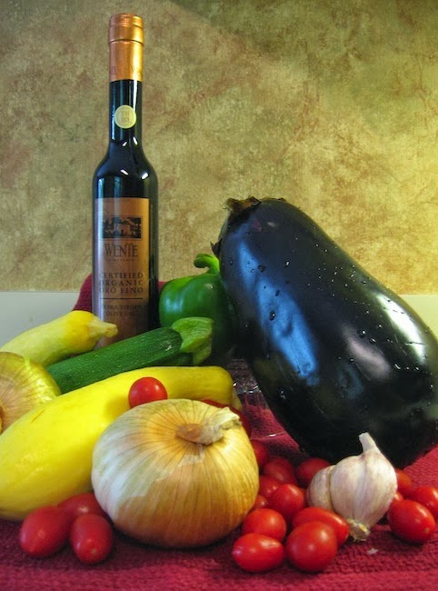
Eggplant cooking tips
Health spa ratatouille
Make-ahead cabbage salad
Mixed baked beans
Pea and carrot salad
Turkish stuffed eggplant
Fresh Herb and Vegetable Pasta Salad

Desserts:

Applesauce spice cake
Holiday Hungarian pastry
Lemon ice cream


Question of the day: Is this index helpful to you? Are there any other blog topics you'd like me to summarize or to index?

Friday, August 30, 2013

Canada's Cape Breton Highlands National Park in Beautiful Nova Scotia

View from the road around the park
     We recently returned from a long-awaited (and long saved-for) 2 week exploration of areas in Nova Scotia and Prince Edward Island, Canada. These provinces, roughly east of Maine (map below), treated us Floridians to gorgeous mountain vistas and clear, refreshing days in the mid 70s with overnight lows in the low 60s or a bit cooler. This trip was so enjoyable for us that I could write a long account, but that would bore you - - and still would fail to capture our full experience. A couple of future posts will describe some particular experiences and locations other than this park.
View from the road

     Rather than start with a description of our itinerary, today I will post a few photos from a large Canadian national park on the northeastern end of Nova Scotia (you should be able to click on them to enlarge them). We spent 3 nights in this area midway through our time in Eastern Canada. Rugged mountains and high plains are never far from ocean views in this park. We hiked several trails and drove the scenic coastal road. No photo can capture the majestic scenery and breathtaking vistas we enjoyed, but I'm hoping you enjoy this taste of Cape Breton Highlands National Park.
Coming out of the forest on the  Skyline Trail
Walkway from the end of the Skyline Trail


Vegetation along the Bog Trail
On the Bog Trail
Blogger is being stubborn today--can't get it to arrange the images nicely. Frustrating, but will publish anyway. Sorry.
No question of the day this time. Thanks for your visit.


Monday, August 5, 2013

A Quiet Night Scene Painting--"November Moon"

     
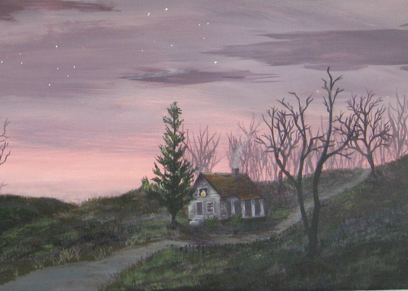
     For a change from local North Florida locations, I tried this night scene, somewhere in Midwestern rolling hills in November before snow has fallen. There were spots like this near the western Michigan city where I grew up, but the scene is not specific to a certain place. Sorry the photo is a bit blurred, but my clearer ones were not at all true to the colors in the piece.
     "November Moon" was inspired by my favorite PBS painting show with instructor Jerry Yarnell. Yarnell paints beautifully in acrylics and provides detailed, extremely helpful step-by-step instruction for well-developed paintings, each completed over several episodes. I learn more from Yarnell's approach and techniques than from the quick, done-in-one-show paintings on some other shows (although one of them was the source of my original feeling a few years ago that, "Maybe I could paint"). 
     I don't ever copy a painting by another painter, and in this case, simply adapted the background of Yarnell's piece with my own trees, road, house, and other details. I tried the hues in his palette which differ from combinations I've used before, but blended them my own way. After his introductory session I was not able to see the subsequent episodes (fortunately I think), so went off in my own direction. He completed his version with a twisted dead tree and some geese in flight (not a house, pine tree, or road).
     The work went fairly quickly and was fun to create. A close-up detail (the colors are not as light as they look in the close-up photo) shows the cozy house on a country lane one November night (As always, click on any photo for a larger view).
Question of the day: Are you also fans of Public TV and Radio and their affiliates (like the Create channel).?

Thursday, July 25, 2013

Post # 200; The Creative Journey Continues

Late Day Clouds at Jacksonville Beach, FL, July 2013
     Here's an odd coincidence; in my very first post on April 21, 2009, I used the cloud photo that inspired my most recent painting. Now, I've reached the 200th post for this blog. Along with my recent 67th birthday, that's cause for some reflection--in the form of blog evaluation and overall gratitude. 

     Evaluation:
     1. Rereading that first post, I see that my intention was to post about twice a week, "perhaps sometimes more". That has slipped into a schedule more like twice a month, occasionally more often. Every so often, I feel badly about this rate and try to do more, but it hasn't lasted--at least not recently. However, my posting pace is right for me at this time. 
     2. Even more than the posting schedule, I try to improve on my once weekly or so session of visiting all the beautiful, varied, and interesting blogs written by the blogging friends I have been fortunate to "meet" along this journey. I'll continue to do my best, and I am humbled by those of you who manage frequent, quality posts as well as visits to other blogs (and comments) in the midst of many other commitments and pursuits.
     3. I do think that many of the posts in this blog have been thoughtfully developed. I know that writing them, editing and polishing them, and choosing appropriate photos has been meaningful for me; writing is a path to discovery, I think--of self and of other things that matter. It's fun to know they are of interest to you, as well.

     Gratitude:
     1. God's love, family, home, extended family, and priceless friends.
     2. Health, especially renewed comfort and mobility after a hip replacement. I don't expect perfect health or total freedom from aches and pains at my age, but overall--much to be thankful for.
     3. Meaningful work and play activities, including tutoring and painting--and so much more.
     4. Rewarding volunteer callings, including helping in the Peace Presbyterian Church Food Pantry (which does astonishing community service for a smallish congregation), pre-GED tutoring at the amazing Women's Center of Jacksonville (discovered through Volunteer Match), working to better our lovely, though very imperfect city through JAX2025, and other projects.
     5. The sometimes gentle, sometimes fearsome, beauty and mystery of nature.

      I could go on--and will in my daily meditation time--but will spare you all that and end with more gratitude.

THANK YOU, THANK YOU TO READERS WHO KEEP COMING BACK IN SPITE OF MY UNEVEN POSTING AND SOMETIMES RAMBLING WRITING. You make blogging fun and worthwhile. 

Sunday, June 30, 2013

"Summer Clouds" - A Characteristic North Florida Scene

"Summer Clouds" by Mary Lemmenes
     Several summers ago (in fact, looking back, it was in 2007!), I took the dog out for a walk and ran right back in for my camera. The towering clouds to our south were amazing that day, although in coastal North Florida, our changeable skies are often stunningly lovely. This view would make a fine subject for a painting, I thought. You can view the original  reference photo below.

     Translating that neighborhood scene to a painting took longer than I had anticipated, but "Summer Clouds" is finally ready to show you. The 18" X 24" acrylic painting, seen on the right, is on gallery wrap canvas and can be hung without a frame--or can be framed if one wishes. The detail photo illustrates some particulars discussed below for readers interested in technical aspects of the work.
Close-up Detail 

     The two major challenges in this piece were: to create an interesting foreground and to convey an adequate impression of the cloud formations. First, although our neighborhood street is attractive, I did not want to use a city street and houses as a foreground. So, I imagined, sketched, and sketched again until a composition plan  seemed workable. I wanted the clouds to "star" and worked to avoid upstaging them with the foreground. Yet, the foreground seemed to need more than just a vague suggestion of ground and foliage. A single tall, dark loblolly pine on the left (balanced by a birch on the right) is a clear contrast to the bright clouds as well as giving some character to the land (the models for these particular trees live on other streets in our neighborhood). In fact, the area where the pine stands against a bright cloud area emerged as the painting's focal point, which Anthony Whiting taught us in recent painting classes is either the darkest dark next to the lightest light or the brightest color in a painting.

     Secondly, painting the clouds as you see them here required gradually building them up in many layers. They cannot be done with a heavy hand (at least, in this style of painting) and yet needed to look as impressive and substantial as they appeared that summer day. They also needed richer color variation and play of lights and darks than we can see in cloud photos.
Reference Photo, Jacksonville, FL

     The acrylic paint palette for this piece includes: Paynes grey, ultramarine blue, cerulean blue, cadmium red light, sap green, yellow ochre, and cadmium yellow light as well as titanium white. When I asked Anthony Whiting for advice as it was nearly finished, he suggested a color mix for the under side of the clouds I never would have dreamed of or tried on my own: alizarin crimson and veridian green--with white as needed. Normally, red and green blends create a brownish neutral or even a rich, true brown (depending on the tones of the original hues), but I was amazed at the warm, rosy purple-grey this blend created. Thanks to Anthony for that! I left some of the shadowed cloud areas of greys and bluish greys I had used originally, but adding some of the new blend (in my view) enriched and enlivened the cloud layers.
Question of the day: Isn't the sky beautiful and miraculous, and isn't the variety in sky scenes across our great land a gift to see?

Saturday, June 22, 2013

Easy, Make-ahead Cabbage Salad Recipe

     I like to make salads ahead of time when possible, especially when we entertain. This cabbage salad is not only simple to make ahead and have ready for a meal; it also keeps well over several days, improving with age. It has a light, fresh flavor and stays crisp. 

     Many years ago (mid-1980's) family members who live in Chattanooga, Tennessee, gave me a Chattanooga Junior League cookbook called Dinner on the Diner. Among our favorite recipes from that book is this "Dutch Cole Slaw". I am sorry that individual contributors are not credited, so we can't thank the creator of the recipe.

     Our dinner guest this past week liked the cabbage salad as well as we do and took the recipe with her (as well as that for the Cuban Carne con Papas--beef and potatoes--it accompanied). We will enjoy the generous amount left over this week, too. The recipe claims that the "Slaw may be kept for several weeks and improves with age," but it doesn't last nearly that long in our house even though there are just two of us. It is delicious with lunches and dinners and has never tasted "old", up to a week later. We can't vouch for the "several weeks" claim.


DUTCH COLE SLAW

1 large head cabbage, thinly sliced or shredded
1 large or 2 medium onions (Vidalia onions are super), thinly sliced
1 sweet bell pepper, thinly sliced 
1 cup sugar
     Put vegetables in a large bowl. Sprinkle with sugar and toss well.

Dressing:
1 cup cider or white vinegar
1 cup light vegetable oil (such as canola)
2 teaspoons sugar
1 teaspoon celery seed
1 teaspoon dry mustard
salt and freshly ground pepper to taste
     Mix dressing ingredients in a saucepan and bring just to a boil. Stir well, then pour hot dressing over cabbage mixture. Mix with vegetables and refrigerate in an air-tight container.

Question of the day: What foods do you like best in the summertime?

Friday, May 31, 2013

Flowering Florida in Our Yard

     After several painting posts, it is time to greet late spring/early summer with photos of flowering bushes and plants in our yard. Thanks to my master gardener husband, both the yard just around the house and our small "wild" back area near a creek are rich with color and variety in every season.


     These photos are all recent--except the white flowering fringe tree, which was from an earlier year. This year the same tree was less showy. The side yard azalea outdid itself in blooming, although the plant remains fairly small. The blue-eyed grass has already bloomed several times and keeps on giving.You see part of the border it makes in front of our home and also a close-up of the little flowers it produces.

     Here's hoping your spring has been pleasant and flowery. Thank you to all of you who continue to check in periodically even though my blogging has slowed down. I am hoping to post a bit more often in the next couple of months.


Wednesday, May 15, 2013

A Third Painting Class Assignment

     We have had a number of painting class assignments since my last post, from painting a row of trees using a random technique designed to loosen our approach, to painting an accurate image in proper perspective of a stucco ranch home. Each class and homework assignment covered a different range of skills and subject matter. This photo shows my most recent completed assignment . 

     For this class, Anthony Whiting brought in copies of a color photo of the well-known "lone cypress" on the Pacific Coast near Monterrey, CA for us to use as a reference for our homework assignment. In class, we began with sketches to determine our particular composition and interpretation of the scene in the photo. Working on the painting on heavy art paper in acrylics at home, I decided to try an under painting method Anthony had suggested at one point--to paint all or major areas of a planned work with the complementary color of the eventual hue. You can see the somewhat garish results below, which is the actual first stage of the homework painting above. I did not use an under painting for the sky area because I wanted to keep it pale and delicate, as it was in our reference photo. 

     One advantage of the complementary under painting here is that the top layer colors really pop against their opposites (orange and yellow under the blue and purple hues in the ocean; purple and grey-blue under the yellow and orange toned rock). In addition, leaving areas where the under painting shows through in the finished work gives the water more movement and a livelier look than painting it only with blues and purples on white paper would have achieved and creates interesting shadows and hollows in the rock. You can click on the image to enlarge it and to see more detail of the under painting peeking through. The palette for the painting itself included ultramarine blue, Paynes grey, burnt sienna, alizarin crimson, Indian yellow, cadmium yellow light, and Titanium white.

     This series of painting classes has been inspiring and helpful for me. Each new assignment and technique provides a learning opportunity, whether or not it seems logical or is within my comfort zone at first. This particular homework assignment yielded particularly pleasing results, and the complementary under painting is a technique I will use again in the future.

Question of the day: When you view visual art works, how great a factor is color in your preferences and enjoyment? Do you tend to prefer brighter or more subdued hues, contrasting or similar colors in the overall piece?

Saturday, April 13, 2013

Painting Class #2 with Anthony Whiting

     The homework exercise for the second painting class with Anthony Whiting was to paint a bowl of fruit. He had suggested we could pull down a reference photo from the internet, but I couldn't find one with the kind of lighting I wanted. So, did it the hard way--set up a bowl of fruit and took some photos. The image to the right shows my finished painting exercise in acrylic paint on 8 1/2" x 11" heavy paper in a bound sketchbook.

     Before painting the fruit, we were to make an outline sketch of the 8 - 12 major shapes in the image, then a 5 value sketch to plan the placement of the lights and darks, and finally some color samples to choose the paint hues we would use. You can see the preliminary exercises page here. I tried my grey scale markers for the value sketch and used 5 of them, from a very light grey to a very dark grey. The markers helped with decisions about placement of values, but did not allow for the kind of subtler shading a pencil sketch can provide. Instead of individual color swatches, I made a couple of choppy stroke blended patches (as in the first class's homework; see previous post). I used a limited primary color palette with only 3 tube colors altogether plus titanium white--alizarin crimson, cadmium yellow medium, and cobalt blue--which created a wide range of color blend possibilities. Limiting the color palette also makes for a pleasing underlying harmony.

     Anthony Whiting's teaching and homework assignments are providing me with new techniques and leading me to real growth. The subjects, brush stroke technique, choppy blending method--and more--are a change for me. And a challenge. Some of what we do for the class is well outside my comfort zone, or, in other words, at the perfect learning edge.

Question of the day: Where is the learning edge in your life currently?


Friday, March 29, 2013

Painting Class #1 with Anthony Whiting

     Looking for inspiration and motivation as well as instruction, I recently started a series of painting classes with Anthony Whiting, a noted Jacksonville artist. The class has been everything I had hoped it would be and is helping me get past a "stuck" feeling in my own work. Since I  never took high school or college  art classes, there are gaps in my knowledge, technique, and ability to create what I have inside. So, I started by attending two of Anthony Whiting's  beginning painting classes--fun and very helpful. Today, you see a color blending exercise from the first class and the completed homework assignment. Soon, I will post the work from the other beginning class I attended. Next week, I will transition into his intermediate class, six two-hour classes for students with some acrylic painting experience.

     The initial two-hour class covered a number of basics listed on a handout. Then, after a demonstration of what Anthony called a "painterly" way to transition from one color to another, we all tried the technique.

     The two color patches show the result of first mixing a range of tones on the palette from white and pale yellow, through greens, to pure blue, then transitioning from white to blue on a sample in choppy, patchy strokes. You can click on the photo to see detail more clearly. Anthony stressed avoiding a smooth blend--instead letting the strokes show. The result is a lively color transition, which achieves a "painterly" blending in the viewer's eyes. Titanium white, cadmium yellow medium, and ultramarine blue are the only tube colors used--all the greens are mixes of yellow, blue, and sometimes white.


     Given my usual smoother blends and more realistic style, this exercise encouraged me to take a looser, less perfectionistic approach, and I really liked learning it. Our homework was to paint a pear using similar choppy strokes, which was more difficult for me than anticipated--a great learning experience. I used the same two colors plus white for the pear, adding burnt sienna for the background and to make grey tones for the shadow and stem by mixing it with the ultramarine blue. You see the sketchbook page at the left and a close-up of the pear above.

     Even though stepping outside my comfort zone is uncomfortable, I always enjoy doing so in a stimulating learning experience. Anthony Whiting is an excellent teacher, effectively encouraging each of us to experiment and learn. This series of classes is exactly what I have been looking for.
Question of the day: Are you also drawn to learning experiences? Do you prefer to try something totally new or to refine your existing skills and talents?

Friday, March 8, 2013

Painting a Water Study--View of Goodby's Creek

     I explored Goodby's Creek, which is a few miles from our north Florida home, and took photos for landscape painting subjects a couple years ago. Recently, I pulled out one of the less dramatic views to paint because the ripples at the edge of the water intrigued me. This 8" x 10" study attempts to capture the feeling of that spot, of overall quietness with gentle, leftover movement in the water from some earlier disturbance.

     Although it is "just a study", not a fully realized painting, this creek view was challenging and required several revisions. I am pleased with the results, with the overall "feel" of the piece. I plan a few minor changes, but wanted to show you this nearly finished stage before coming into a time that will be too busy for any posting.


     For those of you interested in the technical details, the support is a canvas board. The acrylic paint palette included cerulean, cobalt blue, paynes grey, alizarin crimson, cad yellow light, yellow ochre, burnt sienna, buff, and titanium white. Wanting a cleaner look than the actual, quite wild creek bank vegetation, I left out a fair amount and gave the viewer some glimpses of the sky. The painting also increases the light/dark contrasts and highlights the stand of pampas grass and a few other elements. See the original reference photo below for comparison.


Question of the day: Are you inclined to reflect on the features in a scene which interest you and draw you in--or are you more inclined to simply enjoy natural beauty on a feeling level? Or--like me--sometimes one, sometimes the other?

Monday, February 18, 2013

A Walk in the Jacksonville Arboretum

     On a warm winter day last week, my husband, Maggie the super dog, and I enjoyed a magical afternoon walk on the trails at the Jacksonville Arboretum. This delightful preserve, reclaimed from the edge of a former waste dump, has been creatively transformed into a multi-use park and education center. Husband Mark, a master gardener and member of the area Native Plant Society, participated in that transformation, along with many other tireless volunteers. They cleaned up trash, cleared and leveled trails, labeled some trees and plants, and selectively planted others--carefully adding only true native specimens (plants that would have greeted the first European visitors to Florida centuries ago). The 120 acre arboretum is notable for housing several distinct ecological zones in an accessible, walkable whole. 

     We hiked the easy lake trail and then ventured onto another trail above a ravine, where several streams flowed through the area. The experience was fun (doggie delight adds a wonderful dimension), refreshing, and renewing. Although we were within the city limits of Jacksonville, Florida, it felt like a faraway adventure into forests, scrub land, and meadows. I was particularly grateful to be able to walk for over an hour and a half--exercise that would have been difficult and painful before my recent total right hip replacement. It feels miraculous to consider further exploration and gradually greater walking distances in this amazing coastal North Florida region. And, of course, I took a number of reference photos for future paintings, so stay tuned for what that might bring.


    For more information about the Jacksonville Arboretum and Gardens, the web site is here. Other than that, the photos can complete the story of a wonderful day.


Question of the day: What are some of your favorite walks or hikes near home?