Showing posts with label value relationships. Show all posts

Sunday, May 20, 2012

A Rewarding Painting Workshop Taught by Roger Bansemer


This past weekend, I attended a two-day landscape painting workshop in historic St. Augustine, Florida, taught by the noted painter, Roger Bansemer. The paintings in this post are by Roger, one done as a demonstration each of the two days. (By the way, I am trying to set up this post on the new blogger format and having trouble setting up the post the way I want to. I'm not sure how it will turn out--sorry if it's a little strange.) 


Bansemer's instructional painting television program has recently begun showing on our public tv station, and I took a look at his website after viewing an episode. Lo and behold, he offered a painting workshop over Mother's Day weekend only about a 45 minute drive from our home. I liked his painting style and his easy-going, yet very informative, manner on the television program, so enrolled in the workshop, hoping he would be a compatible teacher for me.


The workshop exceeded my expectations. As regular readers know, I tend to paint slowly and cautiously and to get overly fussy with detail in a detrimental way. Roger Bansemer was the perfect teacher to push me to a bolder, more "painterly" approach and to quash the fussiness right from the start.


Each workshop morning began with a lovely breakfast buffet, provided by the staff and volunteers of the St. Augustine Art Association, where the workshop met. Then Roger began the demonstration painting of the day, based on a photograph. He used acrylic paints, as I do, but welcomed students who were working in oils as well. His instruction covered all aspects of landscape painting, beginning with choosing a scene, then establishing the overall composition, balancing values (lights, darks, and in-between values), using a limited palette of colors, and other basics. As he spoke, he illustrated the method in his demonstration painting and kindly tolerated and answered our wide-ranging questions. 


My photos show each of his two demo paintings in an early stage and then at the end of the day after he had gone beyond the initial demo stage, using his lunch period and other free moments during the day to flesh out the piece. To begin, he rubbed a burnt sienna tone into the board as a mid-tone base. Then, he established the major dark areas, some of the lightest lights, and continued to fill in, working all around the piece in a balanced way. Clicking on any photo will enable you to see it enlarged.


After showing us the basics and answering questions, he turned us loose to work on our own chosen paintings and circulated from one student to the next, guiding each person's work. The workshop was very helpful to me, providing new skills, inspiration, and tips focused on my individual needs as an artist.
Question of the day: Isn't learning and stretching ourselves one of the most enlivening activities we can pursue?

Sunday, January 8, 2012

The Importance of Shadows in Landscapes

Recently, I have been reflecting on how important shadows have been in some of my landscapes and seascapes. Although a few scenes, either for reasons of the weather or for the perspective involved have few or no obvious shadows, most landscape painting and photography relies on shadows for drama, contrast, indication of light source, and pattern.
This will be the first of several posts about shadows, and I invite artists and non-artist viewers of nature to contemplate the subject with me. Today, the photos show a painting that originated from my interest in shadow patterns one afternoon, as well as one reference photo from the actual location. The rest of the scene evolved gradually, but the foreground shadows were both the starting point and my primary interest in the project. This is an 18" x 24" acrylic painting on gallery wrapped canvas adapted from a location on a private school campus in Jacksonville, Florida.
In early work, I sketched, then rough-painted indications of some of the darker value areas, as shown in a post about a year ago about the painting process. As the painting progressed, I wanted to create liveliness and interest in the shadowed grass, so tried to vary both the patterns and the colors in the shadows. One of the tricks my essentially mathematical mind played on me involved the patterns. Knowing that a nice balance of variety and related rhythms is most attractive to viewers, I painted in much of the grass and shadow area very quickly, trying not to think overmuch about what I painted where. Oddly, what I produced was a very regular, boring, repetitive pattern. Whoops--good thing that acrylics dry quickly and can be painted over relatively easily. In addition to the shadow patterns and variations in lighter and darker regions, notice the variety of colors--not corresponding to nature, really, but added for vividness and glow. This painting has a fairly strong palette to begin with, including the intense (and sometimes difficult to use) phthalo blue and a strong purple. All the darker tones in my palette appear in the shadows--purples, blues, greens, browns, and greys.
I am thrilled to say that our local son and daughter-in-law particularly liked this piece and accepted it as a second anniversary gift recently. Since it is among my personal favorites as well, it will be wonderful to be able to see it often.
Question of the day: Do shadows fascinate anyone else out there? There is so much one could say, both about actual visible shadows and about shadow as metaphor in life.

Thursday, January 13, 2011

Growing--Planning a Painting Composition--Jacksonville Park Scene

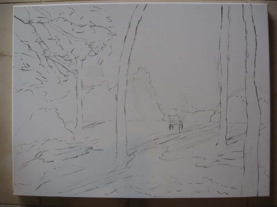
A new 18" x 24" landscape painting on gallery wrapped canvas is nearing completion. I am pleased with the way this scene is turning out and will show you the final version soon. In the meantime, here are the original reference photo, an early line sketch on the canvas, and the first painting stage--blocking in the darkest areas.
As we explore our wonderful coastal North Florida scenery, I take a variety of reference photos for landscape painting. Some photos, like this one, comprise an overall view of a place I might paint in the future. Others record odd bits of information: everything from close-ups of particular tree trunks, to interesting cloud formations, to ripple patterns on our rivers or ponds. One wise word of advice for landscape painting I have heard from more than one instructor is, "Don't make it up." Of course, we do use artistic license to move elements around or to add, say, an appropriate water bird to one of its favorite habitats. However, for me at least, it is crucial to see and photograph the actual water bird or examples of a particular variety of tree in order to paint them convincingly.
While studying reference photos, I make rough sketches of possible compositions based on that location. I try the horizon fairly high, then lower; place only a few tree trunks in the scene, then sketch it with more trunks in a different pattern. In the sketches (often with 5 different grey to black values of markers on cheap paper), I also vary the values, placing the darks, mid-tones, and lights differently each time. A composition with equally distributed values is usually much less interesting than a composition with mostly one value, some of another, and just a bit of the third main value.
For the scene in this photo, I decided to leave out some of the bushes behind the grassy area to reveal the river running behind them. A bench or chair would appear near the riverbank to invite the viewer to enter the scene and rest awhile. Choosing what seemed the most promising small sketch, I outlined the major shapes on the canvas with vine charcoal, which rubs off easily later and which acrylic paint covers well. In some compositions, I begin by "sketching" with a brush and paints in the family of colors I plan to use (more about the palette chosen for this piece in the next post), but for this one, the balance and rhythm of the lines seemed important to place first.
In the top photo, you see a beginning placement of some of the values, especially some of the darkest areas. The foreground shadows first attracted me to the scene and will provide a visual path to the focal point (the bench and its surroundings). The other darkest elements will be some of the tree trunks and the hanging branches at the top of the canvas. Unlike some paintings, this one was pleasing even in the early stages; the composition and value "map" felt right.
Question of the day: As in other creative pursuits, including problem-solving in work and daily life, we are all very different regarding the degree to which we plan ahead. Clearly, I am a planner--how about you?